Summary
TEAM
Me (designer, "implementer")
Ryan Carey (UI designer, advisor)
TIMELINE
August - September 2022
TASK
Migrate Webster Bank's design system from Sketch to Figma.
TOOLS & LANGUAGES
Figma, Sketch, Miro, Excel
Background
A design system stuck in transition
When I joined Webster Bank in June 2022, I discovered their design system was in the middle of a migration from Sketch to Figma. The problem? The migration had stalled.
I saw an opportunity to not just complete the migration, but to truly revamp the system. I offered to lead the initiative - a system that was scalable, accessible, and built with modern best practices.
Final product
A system built for scale
The revamped design system now takes full advantage of Figma's capabilities. With features like auto layout, variants, and boolean properties, the system is far more flexible and maintainable. We established consistent naming conventions for colors and typography.
I standardized components like buttons to align with industry best practices, using constraints, absolute positioning, and other Figma features to make them pixel-perfect and adaptable to future changes.
Previous state
The design system in Sketch was actually pretty well-organized - it had a solid collection of nested symbols. But when it came to Figma, it just didn't translate well. Despite the generally good setup, there were several areas that needed improvement:
First, there were a lot of redundant components because of Sketch's limitations. For example, we had two separate hero components - one with one link, another with two. With Figma's boolean properties, I could consolidate these into a single component.
Second, the styles were a mess. We had 143 text styles, and many colors were poorly named.
Finally, the system lacked smart layout features. Without auto layout, resizing and positioning elements was tedious and time-consuming.
Scope definition
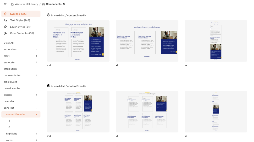
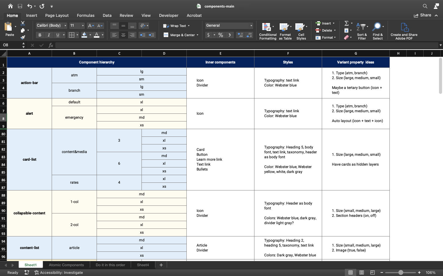
Before diving into Figma, I needed to understand what we actually needed. I created an Excel spreadsheet listing every component in the existing system, noting which ones were actually being used and which had inconsistencies. For instance, several components jumped straight from "medium" to "extra large" sizing with nothing in between.
Using this spreadsheet, I brainstormed the necessary variants and property values for each component. This planning phase was crucial - it gave me a clear roadmap and helped me identify what we could cut versus what needed to be built out. I also consulted with the other designers to make sure my decisions aligned with the overall design strategy.
Styles
With the components scoped out, I turned my attention to the foundational styles - colors and typography. Getting these right was essential for building a consistent, accessible system.
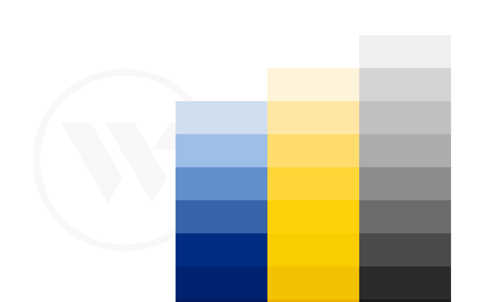
Colors: Building an accessible palette
For the color system, I adopted a naming convention used by established design systems, where colors are defined by a letter representing their function (like P for Primary) followed by a number.
To ensure accessibility, I used a contrast checker to test our neutral shades against background colors. This helped us identify color combinations that met accessibility standards.
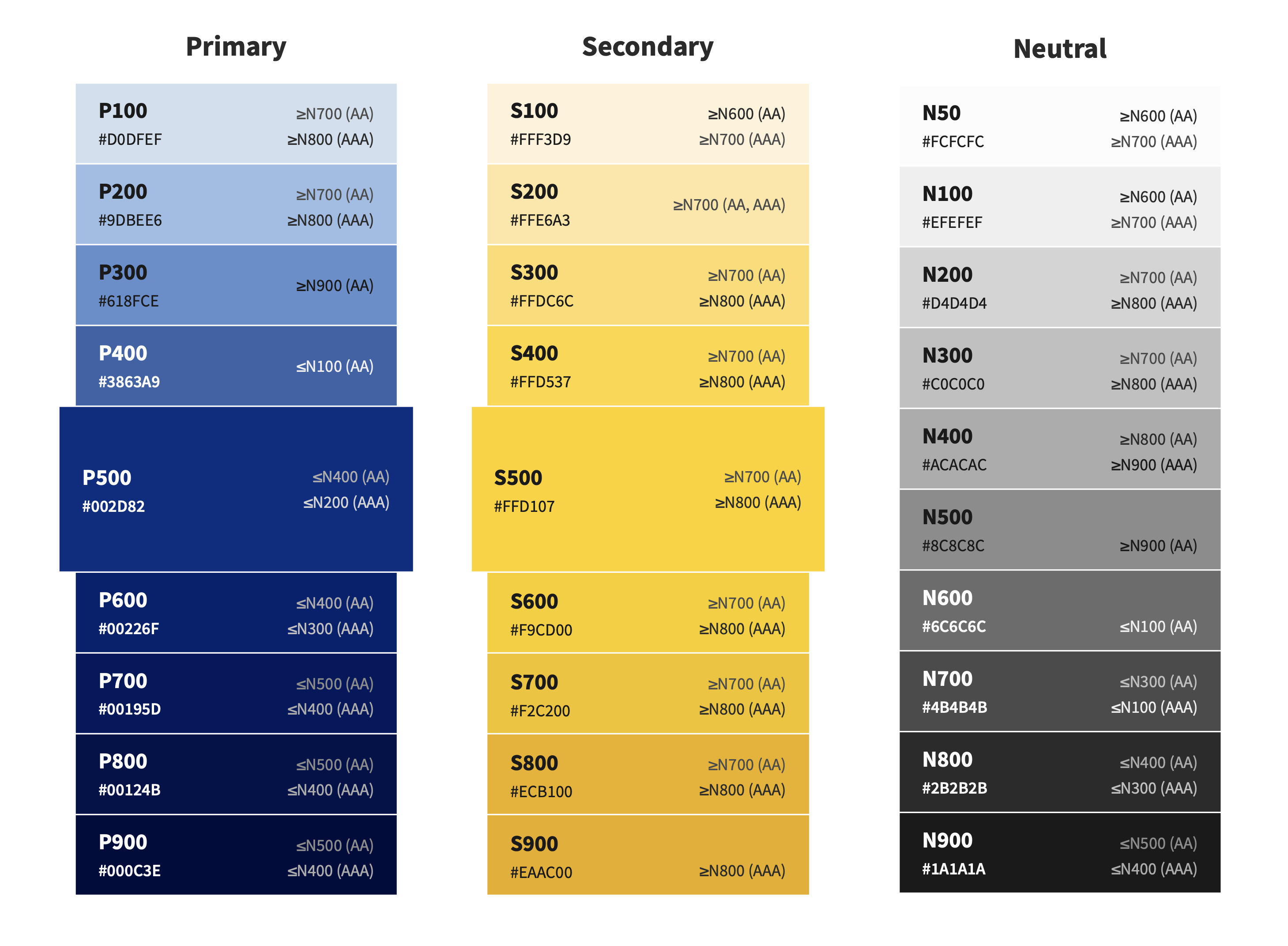
Typography: Organizing 143 text styles
The typography situation was overwhelming at first - 143 text styles in Sketch with no clear organization. I sorted through them all and created four clear categories: Headings, Body, Body Sans, and Taxonomy.
The "Body Sans" category was particularly important. Our standard body font was a serif, but there were places on the site where our heading font was being used as a body font (like in forms). Creating a dedicated category simplified the hierarchy.
Components
The bulk of the work involved rebuilding the components. From my scope definition, I knew exactly which components and variants we needed. Now I had to leverage Figma's features to make them pixel-perfect and maintainable.
Auto layout, constraints, and positioning
Auto layout in Figma simplifies responsive design by automatically resizing content based on the container or its contents. The old Sketch system wasn't using anything similar, so this was a great opportunity to finally implement it properly.
One example shows the difference clearly. The old card component had major issues when resized:
Before
After
The problems: The video thumbnail, play icon, and button would distort when resized. The "Learn more" text would stray from its line on vertical resize and from the play icon on horizontal resize. These issues mattered because cards needed to flex for different text lengths and row widths.
The solution: I set the image to "fill" (maintaining aspect ratio), centered the play icon with constraints, and used absolute positioning for the "Learn more" link with "left and right" + "bottom" constraints. The line next to "Learn more" was set to fill container, so it stretches with the card width. Now everything resizes smoothly and predictably.
Breaking down components
I used atomic design principles to break components into smaller, modular parts. The input component is a perfect example - I split it into a label and a field, each with its own configurable properties. This approach made it possible to create countless variations of a single component without duplicating work.
In the video above, I demonstrate how this works. I change the input's state to error, which makes the error message property available. I turn it on to display a configurable error message. Then I click into the label component and toggle on the info icon and tooltip properties. Next, I drill into the field component and add a left icon, then customize it by changing its type from "user" to "lock." Each nested component has its own set of properties that can be mixed and matched.
This was made possible by using boolean properties to control the visibility of specific layers - like error messages, icons, and tooltips. Each property is only available in the states where it makes sense (for example, only error states can show error messages). This modular design meant I could build one flexible input component instead of dozens of separate variants.
Fixes
While working on the system, I identified two major issues that needed immediate attention - one affecting accessibility, the other affecting usability.
Fixing color contrast for accessibility
I noticed right away that some of our color combinations had accessibility issues. Specifically, when we used "Dark Gray" on "Webster Yellow" (#FFD107), the text didn't adequately contrast with the background.
Previous state
Dark Gray Text
Revised state
Dark Gray Text
The fix was simple but impactful: I changed our "Dark Gray" from N600 to N700, which increased the contrast ratio from 4.37 to 5.97 - exceeding the WCAG AA threshold of 4.5:1.
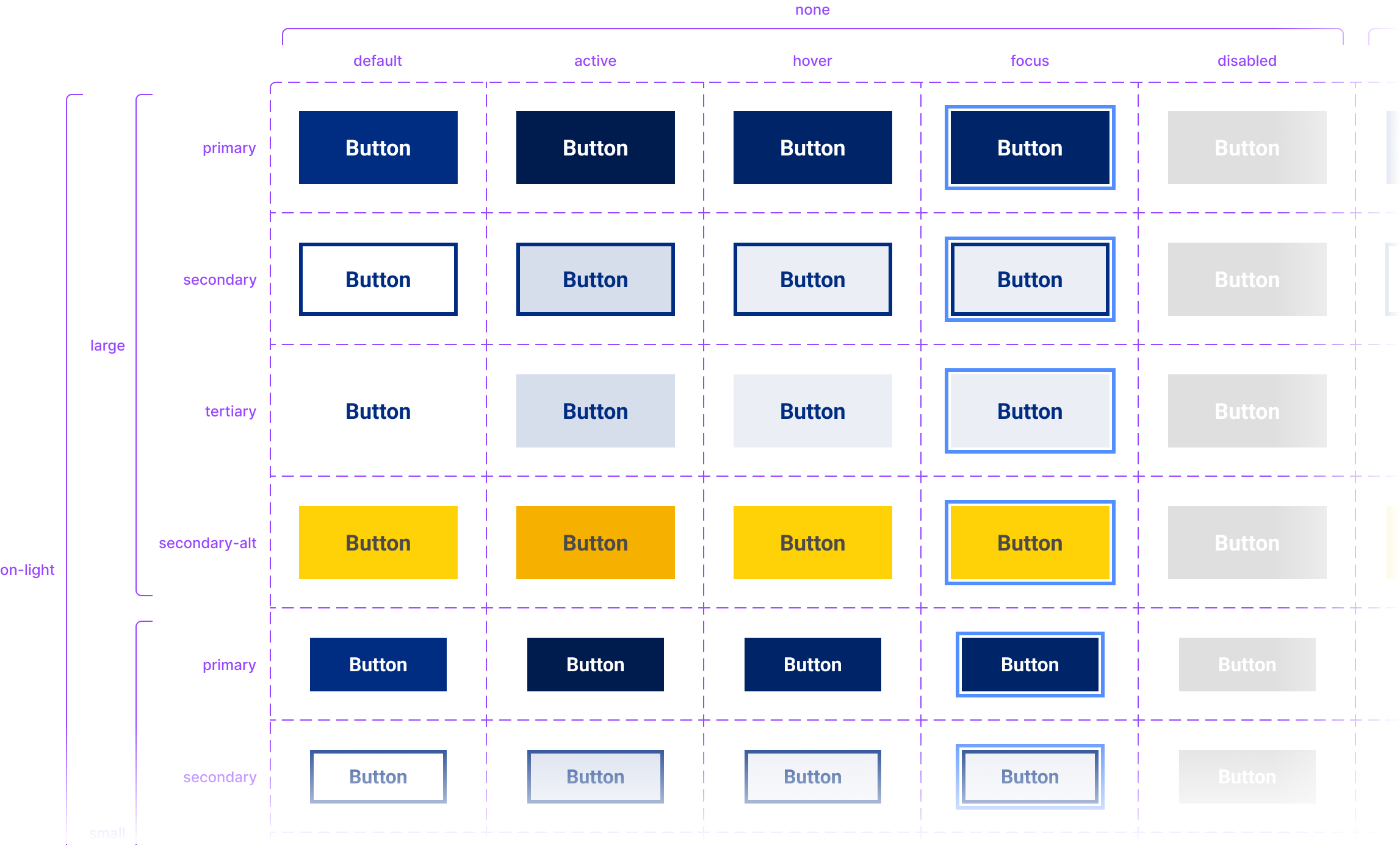
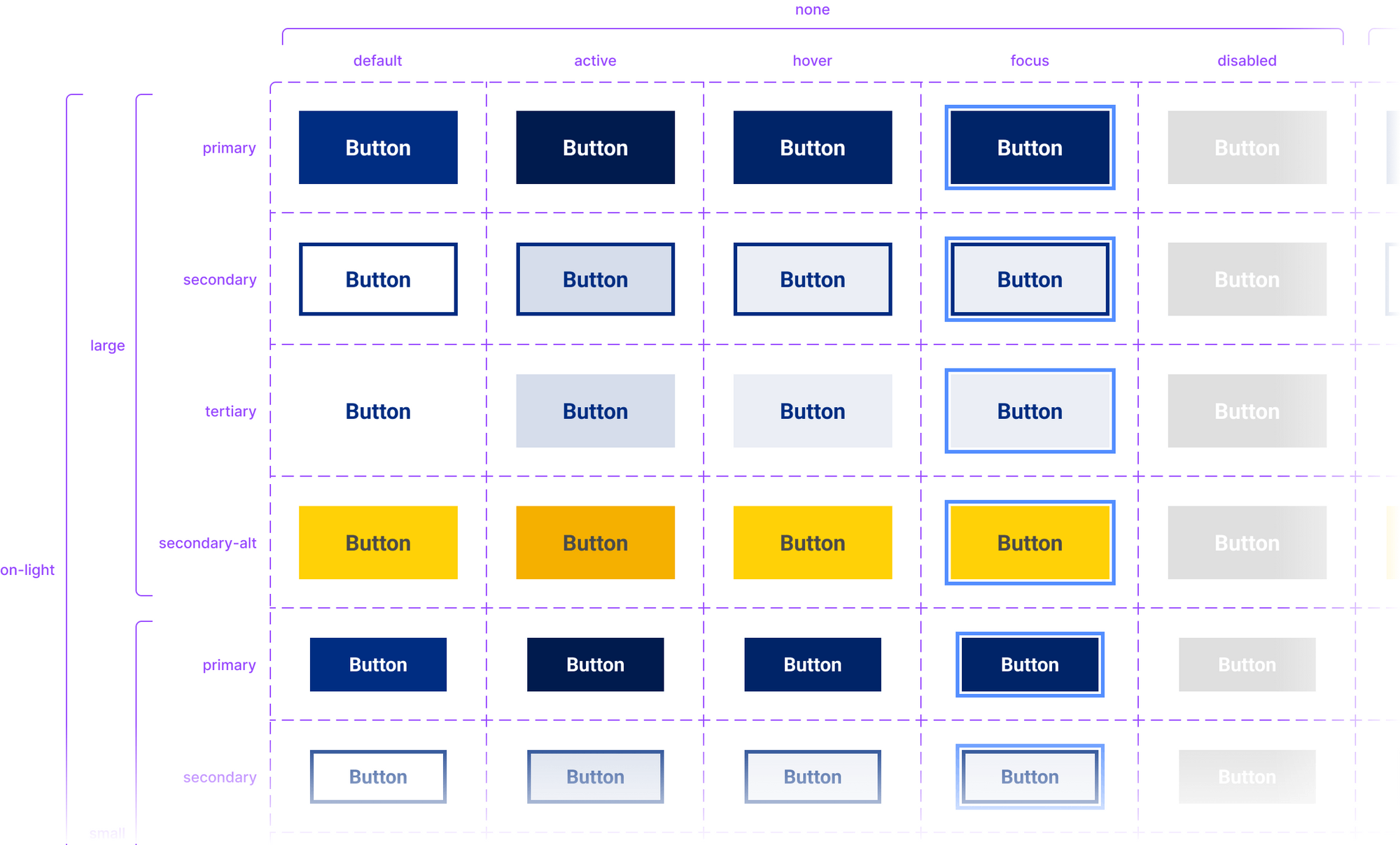
Rethinking primary buttons
In the previous system, Webster was using outline buttons (commonly called "ghost buttons") as primary buttons. This is inconsistent with general design practice - typically, primary buttons should be solid colors to make them more prominent.
The design team collectively decided that a solid blue button would be our primary style going forward. I used this opportunity to also define clear hover, active, and focus states, which had been inconsistent in the previous system.
Tokens
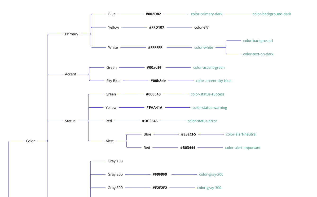
With all the components updated, we wanted to take things a step further and research design tokens to make the system even more scalable. I used the Tokens Studio for Figma plugin to brainstorm all possible tokens.
I created a mind map in Miro to map our styles to specific tokens and aliases. For example, our primary blue was labeled "color-primary-dark" and also aliased as "color-background-dark".
As a first step, I focused on organizing our typography tokens, which are compositions of several other tokens like font family and font size. This helped simplify the hierarchy of text styles and made the system easier to maintain.
Heading 4$font-heading-4 | Body$font-body | Body Sans$font-body-sans | |
|---|---|---|---|
| Font family | Roboto$font-family-heading | Source Serif Pro$font-family-body | Roboto$font-family-heading |
| Font size | 30px$font-size-7 | 18px$font-size-4 | 18px$font-size-4 |
| Font weight | light$font-weight-light | regular$font-weight-regular | regular$font-weight-regular |
| Letter spacing | 0$letter-spacing-default | 0$letter-spacing-default | 0$letter-spacing-default |
| Line height | 1.2$line-height-short | 1.5$line-height-default | 1.5$line-height-default |
| Paragraph spacing | 0$paragraph-spacing-none | 0$paragraph-spacing-none | 0$paragraph-spacing-none |
| Text case | none$text-case-none | none$text-case-none | none$text-case-none |
| Text decoration | none$text-decoration-none | none$text-decoration-none | none$text-decoration-none |
Next steps
There's still work to do - building out the remaining tokens and getting developers fully onboarded with Figma. But this process taught me a lot about the complexities of design systems and gave me valuable hands-on experience with Figma's more advanced features.
Design systems, when done well, are incredibly powerful
Having a single, well-built input component that can be applied to any input field is a game-changer. And tokens make scaling even easier - I'm excited to see how they work in practice with our development team.
Planning was crucial
Taking the time to inventory the existing system and map out a clear plan helped me understand all the pieces and organize them logically. It would have been much messier without that upfront work.
Iteration is key
This is a strong first iteration, but design systems need continuous testing and refinement. As we use it more, we'll discover areas for improvement and ways to optimize it for our workflow. The work is never truly "done."