Summary
TEAM
Me (UI designer)
TIMELINE
September 2021
TASK
Convert wireframes to high-fidelity designs while incorporating insights from customer feedback and support requests.
TOOLS & LANGUAGES
Figma
What's Inkbench?
Inkbench was a brand management SaaS startup I worked for from May 2020 until May 2022. We helped franchises maintain brand consistency by letting them store digital assets, create locked-down templates, and distribute them to franchisees - preventing the "off-brand materials" problem common in multi-location systems.
I was tasked with redesigning the dashboard, which was the first screen users saw after login. The existing version had usability issues that limited its effectiveness.
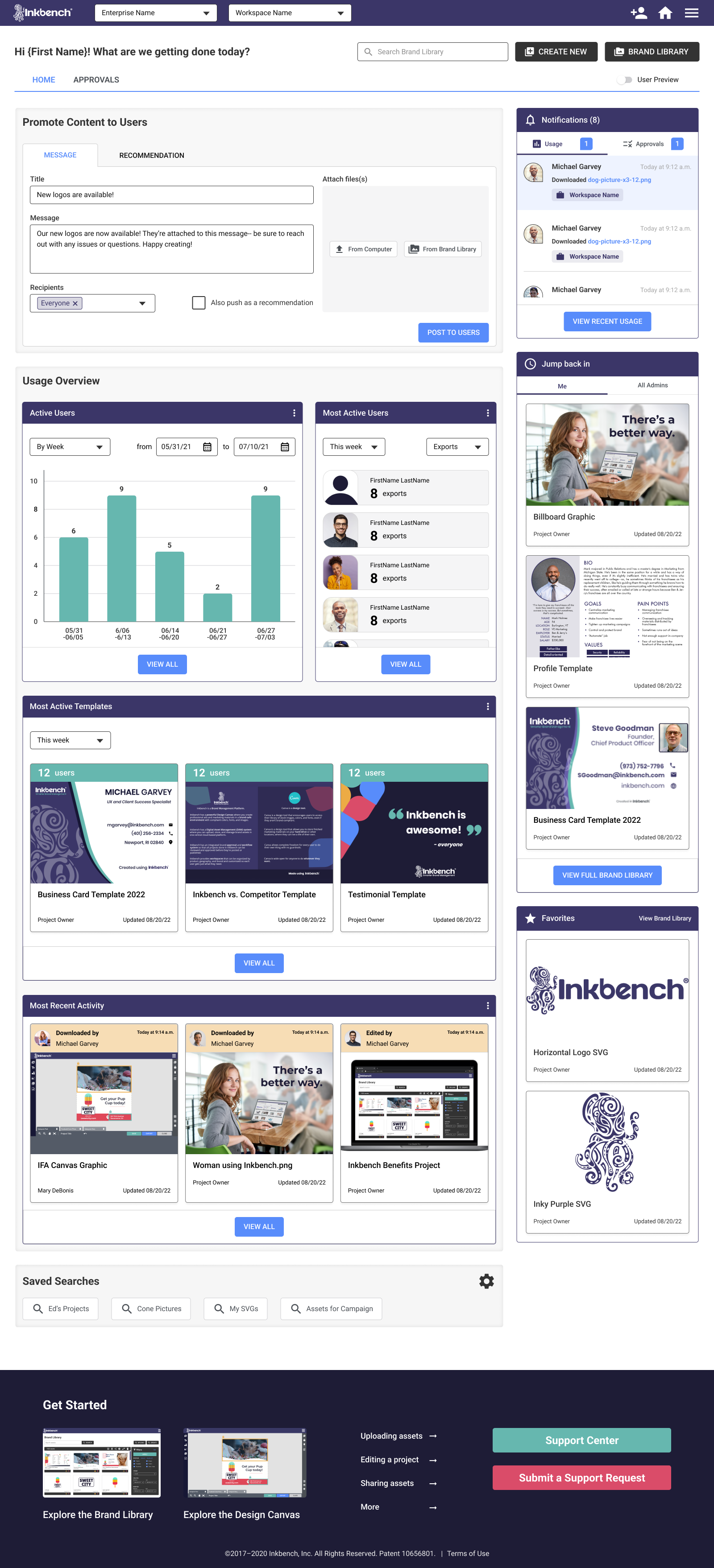
Final product
Analytics and simplified template editing
Though never developed due to Inkbench's shutdown, user research showed these features would have reduced stress around brand distribution and allowed franchises to customize materials without one-off requests.
For franchisors, a true analytics dashboard
For franchisees, a form-powered, always-on-brand template editor
KEY FEATURES
- Messaging system. Franchisors can give their franchisees directions, materials, and customizable templates all in the same place.
- Usage trends. Detailed graphs that give franchisors a sense of platform engagement with the option to export as a PDF or CSV.
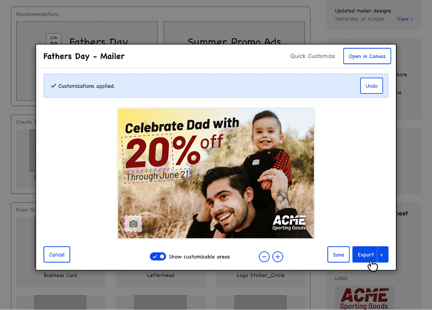
- Pre-approved, locked-down templates. Users can export immediately from the customization screen, eliminating any back-and-forth between franchisor and franchisee.
Previous dashboard
I analyzed the previous dashboard to understand how it differed from the wireframes I'd been given, which helped me identify improvement areas and ensure the new design met user needs.
How it looked and worked
The previous dashboard's goal was to provide the user with the most relevant items to them when they logged in. Administrators could pin certain brand assets or design templates to the dashboard for everyone to see, and support articles could be accessed at the bottom of the screen.
THE PREVIOUS DASHBOARD
A view of the dashboard in July of 2020.
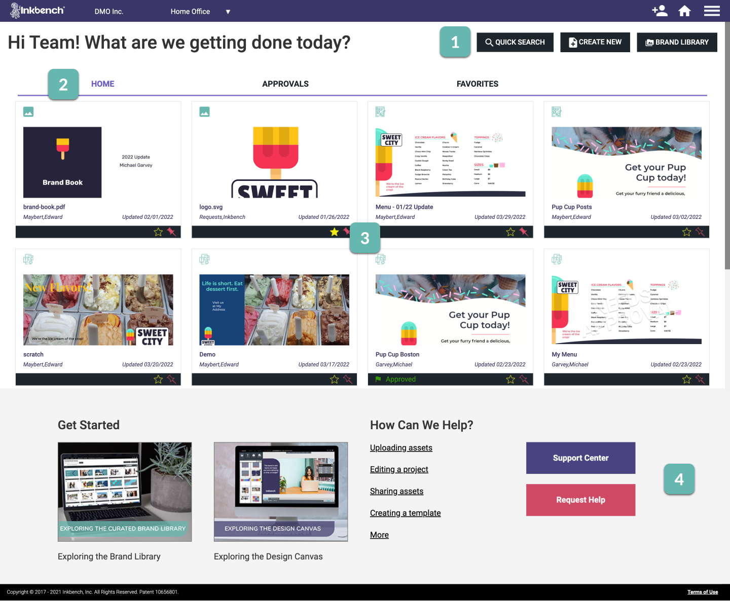
Action buttons. Search or open the Brand Library, or create a new project.
Tabs setup. The Home tab is the same across the Enterprise (i.e., everyone sees the same stuff). Approvals are projects pending approval, and favorites are assets or projects you've marked as special to you.
Pinned items. Administrators can "pin" items to the dashboard for everyone to see, access, and use.
Support links. Helpful Center articles to get started on the platform
Untapped potential
The dashboard showed everyone the same screen despite franchisors and franchisees having different goals. Franchisees wanted simple template customization (not our complex design canvas), while franchisors wanted analytics on platform usage - data that existed in the backend but wasn't accessible to them.
AREAS OF OPPORTUNITY
- It's the same for everyone. Franchisors and franchisees have very different goals when using the platform, but the first thing they see is identical. The different goals imply that seeing different things to cater to these goals may be helpful.
- No oversight for franchisors. Franchisors can't see what franchisees are doing. They want more oversight and insight into their platform usage-- what's being used, who's using it, and how the platform is being picked up.
- Lack of communication ability. While franchisors can pin items to the dashboard, there's no way to communicate what they want their franchisees to do or send them messages, requiring them to leave the platform to communicate.
Analyzing the wireframes
I converted wireframes into high-fidelity designs. The wireframes split into two dashboards: one for franchisors with analytics, and one for franchisees with simplified templating.
FRANCHISOR DASHBOARD WIREFRAME
The Franchisor Dashboard included three major upgrades: a messaging system, usage overview, and notifications.
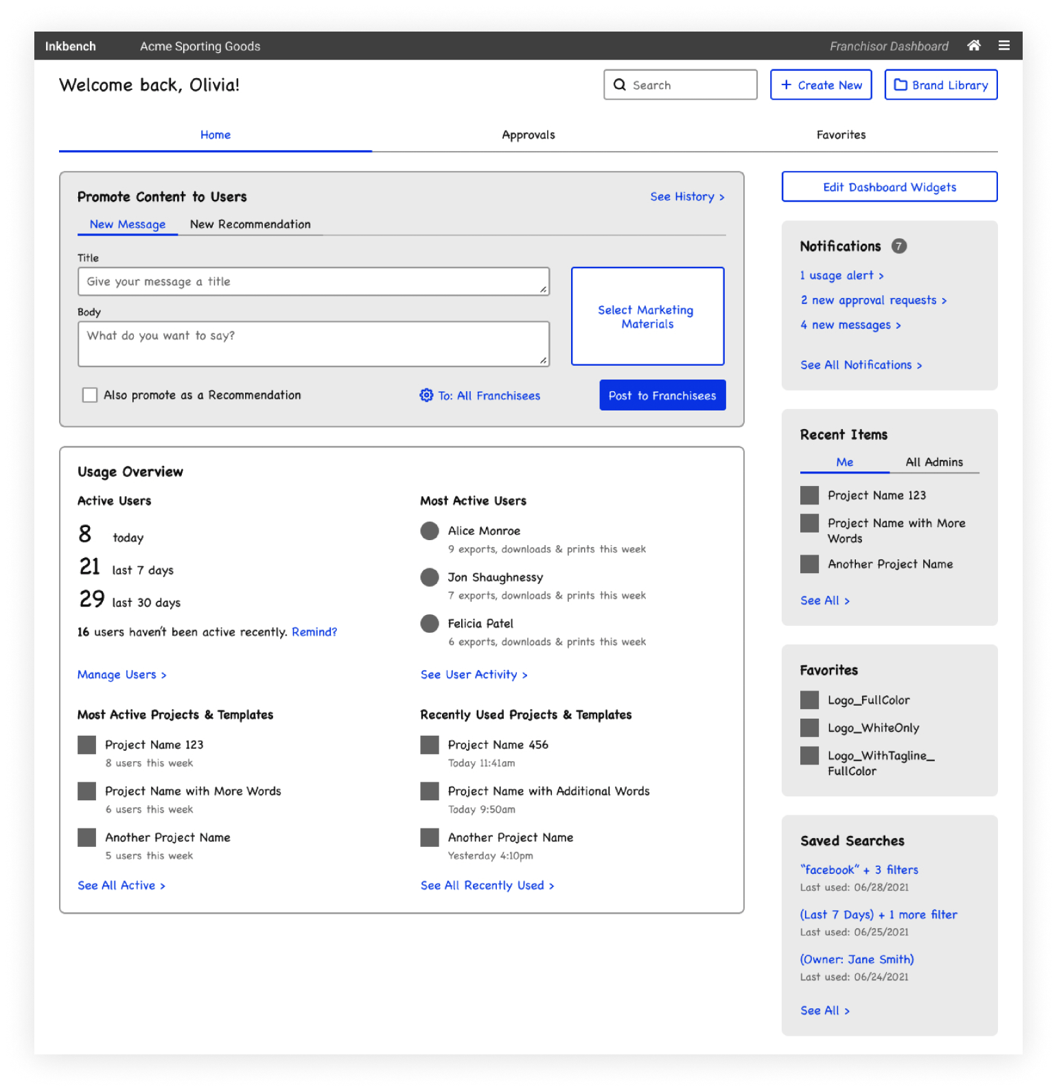
Communication with franchisees. Administrators can push content to users, such as messages and "recommendations" they can customize.
Active users. Active = has signed in and made one export, download, or print, for today, the last week, and the last month.
Most active users. (Excludes administrators) Who's done the most of the actions?
Most active projects and templates. What projects have the greatest number of unique users exporting them?
Recently used projects and templates. What is the most recent activity on the platform?
Notifications. A hub for updates about usage statistics, approval workflow requests, and messages from franchisees.
The wireframes were designed with two main principles in mind: 1) to enable franchisors to provide franchisees with materials while monitoring their activity, and 2) to make it as simple as possible for franchisees to customize their designs.
UI Design
The UI design process was the majority of my work, and it required me to define a set of styles and apply them consistently throughout the product. By making adjustments to some functionality represented in the wireframes, I was able to better align the design with user expectations.
Defining design standards
Since Inkbench didn't have an established design system, I created a UI kit based on industry best practices to ensure consistency throughout the product.
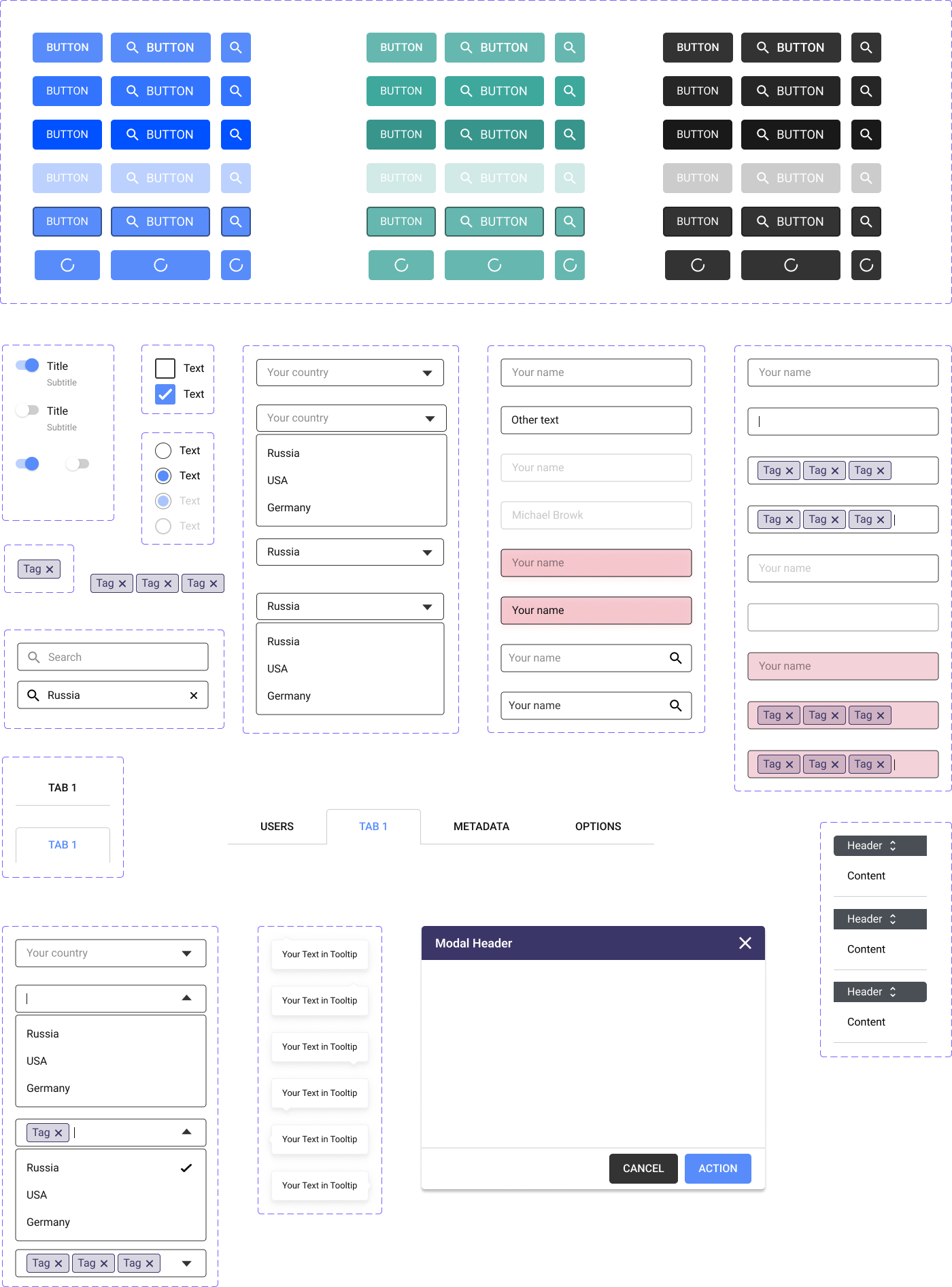
High-fidelity mockups
High-fidelity mockups for the franchisor dashboard, franchisee dashboard, and "EZ" templating feature.
Key changes from the wireframes
During design, I identified opportunities to improve usability and accessibility, leading to two main changes from the wireframes: EZ templating and the usage overview.
Change 1: EZ templating → form
WIREFRAME STATE
Clickable fields (outlined with a dotted, pink border below) that allow users to customize a template.
PROBLEMS
- Accessibility. The low visibility of these pink borders may cause confusion for users, as they may not be able to see the editable elements within the design.
- Visual clutter. Graphics are already detailed - adding borders could overwhelm users and create support requests about export visibility.
HI-FI STATE
Instead of having clickable fields embedded within the graphic, I implemented a form-like structure for editing.
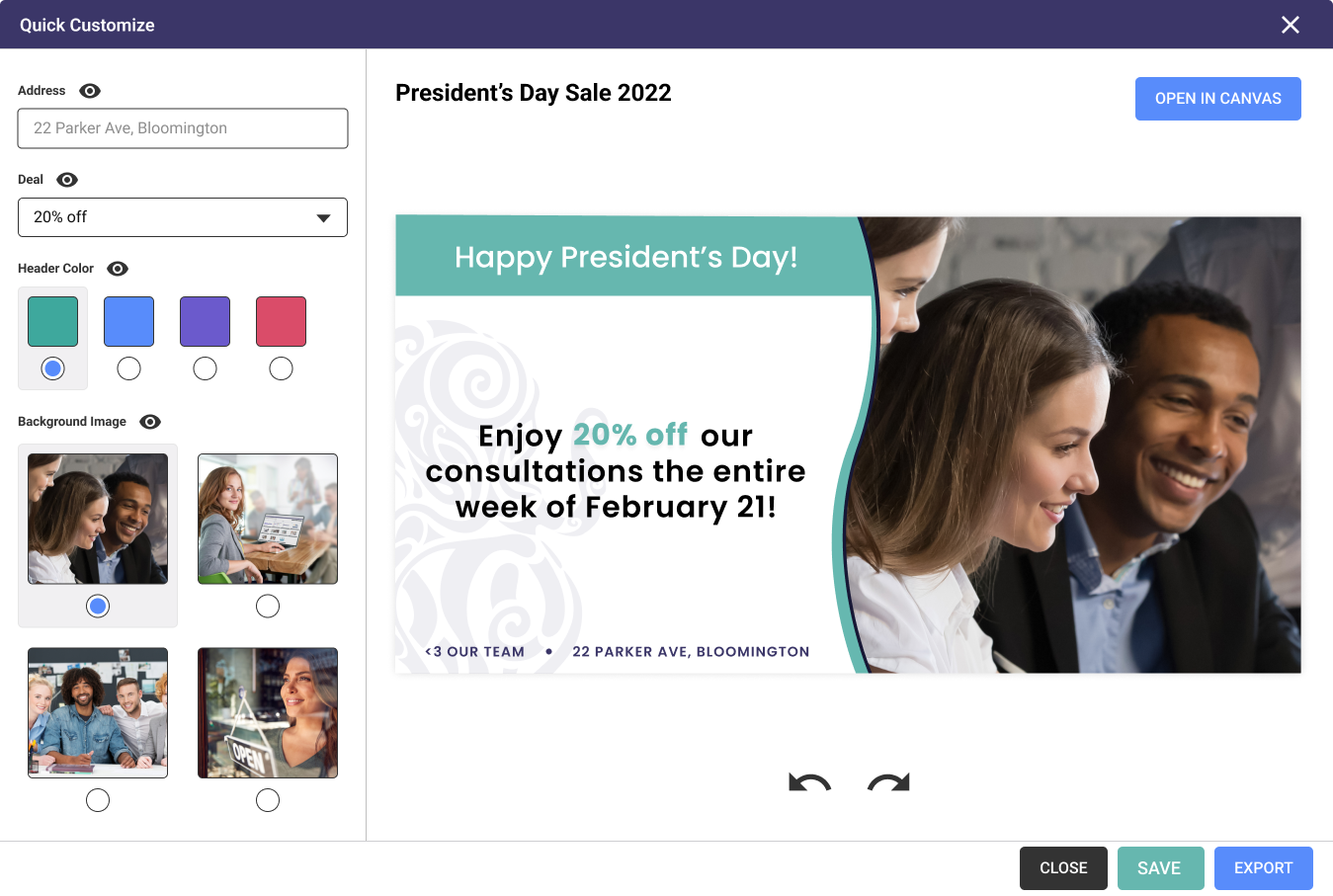
HOW IT ADDRESSES THE PROBLEMS
- Fewer accessibility concerns. The fields users can edit can be named by the template creator, helping to better identify them on the graphic and view their potential options in the form.
- The preview is what you get. Users can rest assured that whatever they see in the preview is exactly what they'll see on export.
Change 2: Building out the usage overview
WIREFRAME STATE
Links suggested in-depth analytics views, but no detailed screens existed.
PROBLEMS
- Completeness. I needed to define where these links would go for developer handoff.
HI-FI STATE
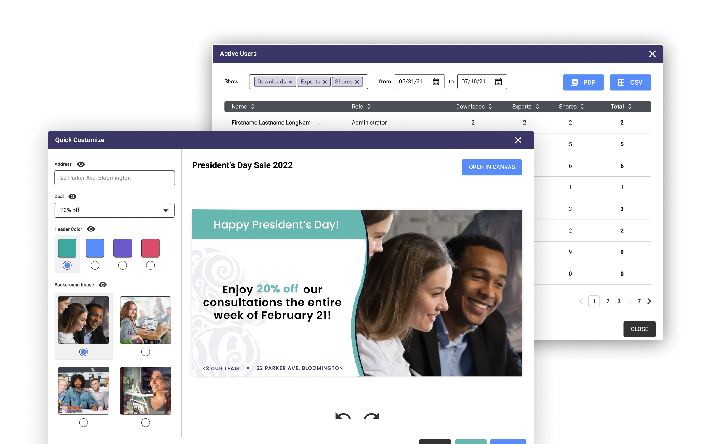
Each button opens a modal containing more in-depth views of the data.
HOW IT ADDRESSES THE PROBLEMS
- Completion. The screens exist! Woo!
- Facilitates data analysis. Giving the user the option to download as a PDF or CSV allows them to perform data analysis that is not native to Inkbench.
Final UI
Below, you'll find a screenshot of the final UI design. To fully experience the product, I recommend exploring the prototype. The "user preview" button allows you to toggle between the franchisor and franchisee dashboard views.
It is worth noting that if Inkbench were still with us, I would have loved to conduct usability tests with our clients to validate some of the changes I made. This would have provided valuable insights and feedback and helped ensure that the final product met the needs of our users.
Overall, my goal was to create a user-friendly, efficient, and accessible product that would meet the needs of both franchisors and franchisees. I believe that the changes I made and the final UI design achieved this goal and would have been well-received by our clients.
TAKEAWAYS: FINAL UI
- Participating in the research is something I want. I regret not being able to participate in the initial research process, as it made the project more challenging for me. However, it was a great learning experience and an opportunity for me to test and strengthen my skills.
- Design systems are important. The absence of a pre-existing design system presented an additional challenge for the project and required me to create one from scratch. This introduced me to new concepts, such as atomic design, and allowed me to expand my design knowledge.
- Communication with developers is essential. Designing within technical constraints is crucial, and I collaborated with developers to ensure the feasibility of my design.