Summary
TEAM
Me (researcher, designer, developer)
TIMELINE
April - May 2022
TASK
Design and develop a site that combines Newport in Bloom with the Daffodil Days Festival.
TOOLS & LANGUAGES
Figma, Adobe Illustrator, WordPress, Elementor Pro, CSS & HTML
"Two" many sites
Newport in Bloom and Daffodil Days are nonprofits committed to beautifying Newport, Rhode Island, with flowers. Newport in Bloom hosts city events, and Daffodil Days is a festival to celebrate the daffodils they plant in fall, which bloom every April. These two groups have significant membership overlap and wanted to combine their websites. Specifically, the Newport in Bloom site wanted to absorb Daffodil Days.
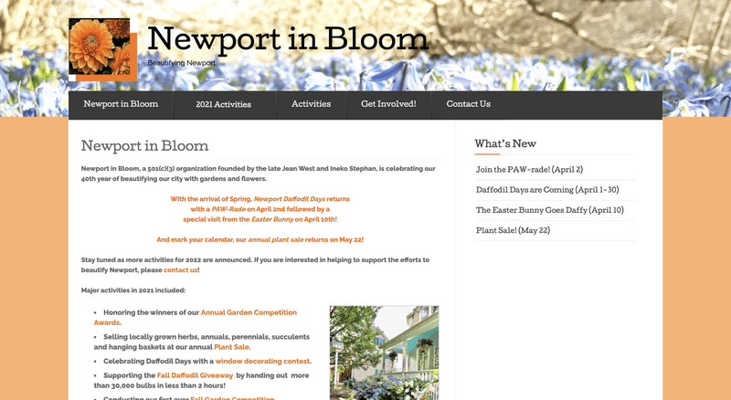
newport in bloom: Before
A screenshot of the Newport in Bloom home page in December 2020.
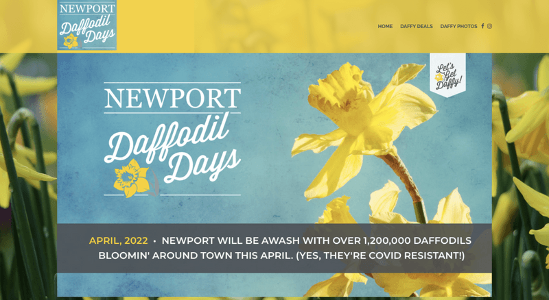
daffodil days: Before
A screenshot of the Daffodil Days home page in December 2020.
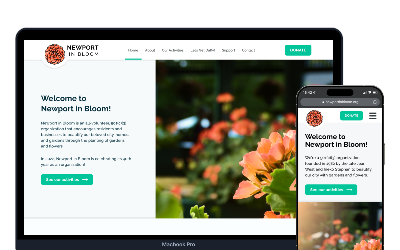
A new brand, consolidation, intuitive structure, and responsivity
The design system is now fully integrated with modern web capabilities, resulting in a more scalable and accessible system.
RESULTS
- Website costs cut in half. The hosting costs for the Newport Daffodil Days site were eliminated, and having all the information in one place simplifies their web hosting process.
- A reorganized site map. This simplified website updates and improved user navigation. The redesign was tailored to the needs of the new Newport in Bloom webmaster and the users who would visit the site.
- An opportunity to show off their new brand. They feel proud and happy to put their new logo on their stationery, flyers, and posters!
- Full responsivity. Whatever device you're viewing the site on, its layout makes sense and adjusts to fit the screen.
Research
Before beginning the design process, I formulated a set of research questions to guide my investigation. These questions pertained to the current websites, the users, and the goals of the committees. The guiding questions were:
- What are the current purposes of the sites?
- Why do stakeholders want the sites merged and redesigned?
- What do people think of the current sites?
- Has anyone ever visited these sites? If so, why?
- How do other nonprofits structure their sites?
Stakeholder interviews: Getting to know the organizations
First, I needed to understand who and what I was working with-- what do committee members want, why do they want it, and what are the sites like now? I talked to three committee members and the Newport in Bloom webmaster to figure this out.
User interviews: Gathering user perspectives
With a clear understanding of the committees' goals, I conducted user research by interviewing 6 individuals, evenly divided between those who had participated in Newport in Bloom events (gardeners) and those who had not (non-gardeners). The aim was to gain insights into their goals and needs.
What are other nonprofits doing?
I also researched other nonprofit organizations as part of my investigation. I examined the websites of nonprofits in Newport, national-level organizations, and other local garden and flower-related nonprofits or festivals. This broad research helped me identify patterns across categories.
Newport nonprofits
The Preservation Society of Newport County preserves and protects the area's architectural, decorative arts, landscape, and social history. They run the Newport Mansions, which primarily make Newport a tourist destination.
- Significant amount of information
- All pages are accessible from the primary navigation menu— some have four levels of dropdowns
- Photo-heavy (pictures of mansion interiors, exteriors, gardens, etc.)
- On specific pages, they employ secondary navigation in the form of a sidebar
- Primary CTAs are for member login, ticket purchase, and donations
- Several auto-rotating carousels with full-page pictures
The Newport County YMCA is an organization that tries to bring together the community through programs and activities that help develop spiritual, mental, and physical well-being.
- Photo-heavy; includes several photos of happy children and employees
- Also a significant amount of information, structured within the primary navigation
- For particular events, a good reusable template: hero image, title, program contact, related programs, and action items
- Primary navigation takes up a significant portion of the page real estate
- Primary CTAs are to view upcoming events and to register for particular programs
- Several different places to donate
Garden and flower nonprofits
The Portland Rose Festival is an event held every June in Portland, Oregon, with lots of parades and activities promoting both Portland and its beautiful flowers.
- Simple, flowery monochrome logo
- Calendar of upcoming events
- Primary CTAs are donate and purchase tickets
- Lots of focus on the directly upcoming event (even a live countdown)
- Several full-page images
- Event pages include a hero image, title, and a sidebar with relevant information
- Can search through events and filter them
- Whole-site search functionality
The National Cherry Blossom Festival is an organization devoted to hosting activities to promote and educate about the environment, arts, and culture in Washington, DC. The primary event promotes cherry blossoms, which bloom in late March and early April.
- Brand color (pink) extends throughout site
- An autoplaying carousel is the main focal point of the homepage
- The primary CTA is donate
- For each event, there's a sidebar with general important information
- Lots of cards with a similar format (title, picture, subtext, learn more button)
- Two navigation bars at the top, one sticky, one not
National nonprofits
ACLU is an organization devoted to preserving people's constitutional rights by offering legal assistance in cases where civil liberties are at risk.
- Primary CTA is very clearly "Donate"
- Carousel of images is general hero; includes the option to stop autoplaying
- Sticky email subscription input
- Site is organized by issue
- Search and filter available for particularly long results pages
The Boys & Girls Club of America provides programs for kids and young adults across the country.
- Carousel hero with images of happy children; similar to Newport County YMCA
- "I am a <dropdown>" form field which brings you to a specific page dependent on the option you choose
- Various types of templates used, generally lacking a consistent format across the site
- Breadcrumbs to facilitate user navigation
- Some reused templates, especially for programs
TAKEAWAYS
I found two common approaches to designing nonprofit homepages: one that presents a blatant call to action without much information (a more visual, grabbing experience), and another that provides more information about the organization with CTAs less obvious on the page.
While both types of sites displayed the information users were likely to want to find, they differed in the amount of clutter. I knew from stakeholders that Newport in Bloom wanted their site to be image-heavy, but I also knew from the research that they wanted to share their story and mission with everyone who landed on the site.
It was important to find a balance where the home page could tell their story but also avoid text-heavy chunks.
Define
The goals were ambitious: I had to combine two nonprofit websites, make a better user experience, implement Newport in Bloom's new brand, and make the site responsive to tablet and phone screens. Once the research was concluded, I synthesized the results to define two design goals. These goals specifically targeted the aspects I wanted to prioritize in order to create a more user-friendly site.
Minimize site clutter and streamline content across all pages.
The main issue with the current sites (particularly the Newport in Bloom site) is that there is too much to sift through to find the information a user wants. Ultimately, all types of users want simple information. The way the old site presents itself does not help users do this. I will design this site to guide every category of users toward the information that would be most relevant to them-- quickly and clearly.
Design the site to be accessible on multiple devices.
I heard from a couple people that they wished these sites looked good on their phones. The site should be fully accessible on phones, tablets, laptops, and desktops. I chose to follow a mobile-first design process in order to ensure responsivity.
Content and structure: Merging and reorganizing
I evaluated the existing content to find what should stay and what should go. This was very collaborative with the stakeholders: I made some recommendations, they made some recommendations, and we worked toward a final site map.
BEFORE: TWO SITES
Newport in Bloom
- • Home
- • About Us
- • Beautification Projects
- • Adopt-A-Spot
- • How You Can Help
- • Events
- • Calendar
- • Gallery
- • Contact Us
Daffodil Days
- • Home
- • Festival Events
- • Photo Contest
- • About Us
- • Support Our Mission
- • Contact
AFTER: ONE CONSOLIDATED SITE
- • Home
- • About
- • Beautification Projects
- • Daffodil Days Festival
- • Gallery
- • Get Involved
- • Contact
Design
With a clear understanding of the goals, I began the design process. I started with wireframes to establish the structure and flow, then moved into high-fidelity mockups that incorporated Newport in Bloom's new branding.
Wireframes: Establishing information hierarchy
I started by sketching out initial ideas for the home page layout. These rough sketches helped me quickly iterate on different approaches to organizing the content.
After sketching, I created digital wireframes in Figma. I focused on mobile-first design to ensure the site would work well on all devices.
Styling: Implementing the new brand
Newport in Bloom had recently worked with a graphic designer to create a new logo and brand identity. My task was to take this new branding and apply it to the website design. Their font remained the same but was paired with a new color palette, featuring colors that complement plants and flowers.
COLORS AND TYPOGRAPHY
Color Palette
Primary
#00C49A
Secondary
#FFD203
Primary Decorative
#FFC58D ➞ #FF8266
Accent Dark
#062F3D
Dark
#333333
Light
#FBFEFF
Typography
Aa Raleway Bold
Lorem ipsum dolor sit amet, consectetur adipiscing elit. Sed do eiusmod tempor incididunt ut labore et dolore magna aliqua.
Aa Raleway Regular
Lorem ipsum dolor sit amet, consectetur adipiscing elit. Sed do eiusmod tempor incididunt ut labore et dolore magna aliqua.
Test
Before finalizing the design, I conducted usability testing to identify any issues and ensure the site met user needs. I tested with both gardeners and non-gardeners to get a comprehensive understanding of the user experience.
Usability testing: Finding pain points
I conducted moderated usability tests with 5 participants (3 gardeners, 2 non-gardeners). Each participant was given a series of tasks to complete while thinking aloud. I observed their behavior and noted any points of confusion or frustration.
TEST TASKS
- 1. Find information about the Daffodil Days Festival
- 2. Learn how to get involved with Newport in Bloom
- 3. View photos from past events
- 4. Find contact information
- 5. Navigate to the about page
KEY FINDINGS
- Navigation confusion: 2 participants struggled to find the Daffodil Days information, expecting it to be more prominent.
- Gallery location: Participants expected the gallery to be in the main navigation rather than a subpage.
- Mobile menu: The hamburger menu icon was too small on mobile devices.
- Call to action visibility: Users wanted more prominent buttons for "Get Involved" and "Donate".
Priority fixes: Addressing usability issues
After reviewing usability testing notes, re-watching the Zoom recordings, and consulting with committee members, I identified three main issues to address, along with several additional minor improvements.
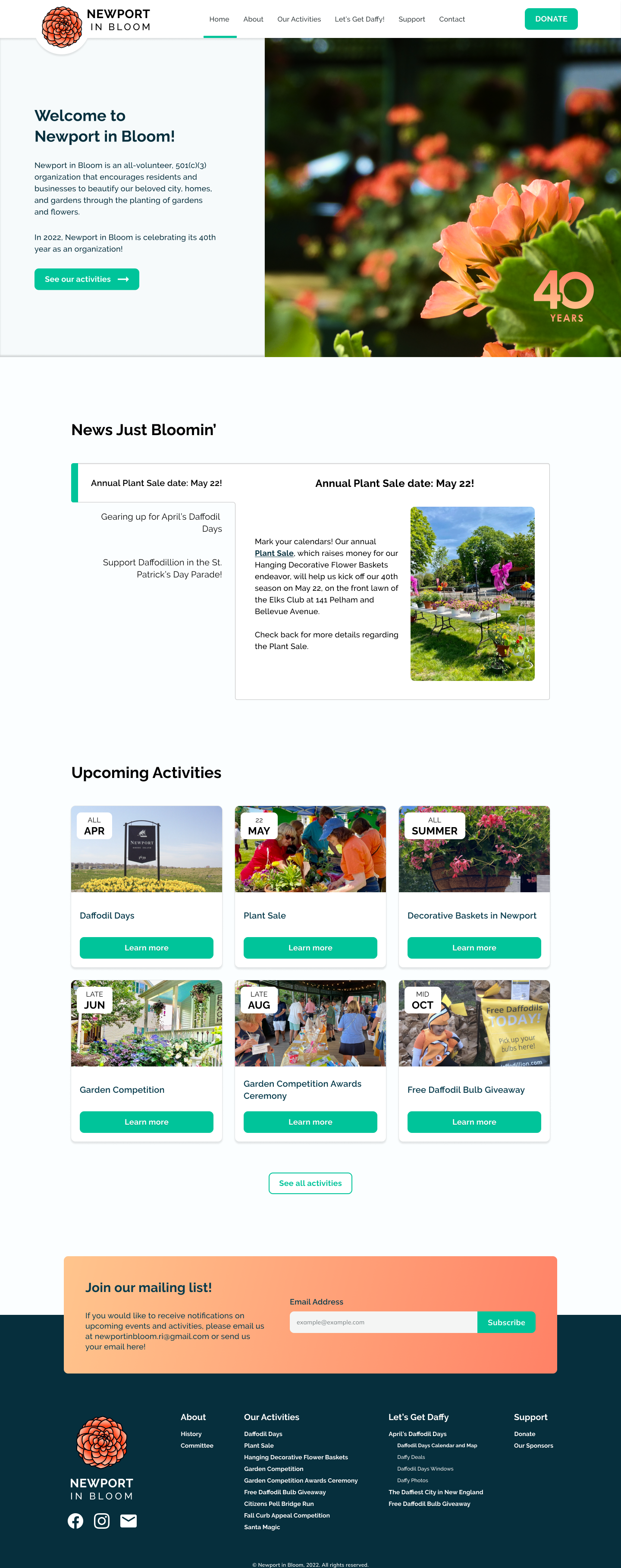
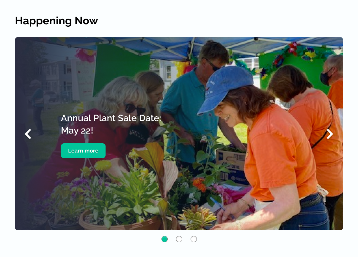
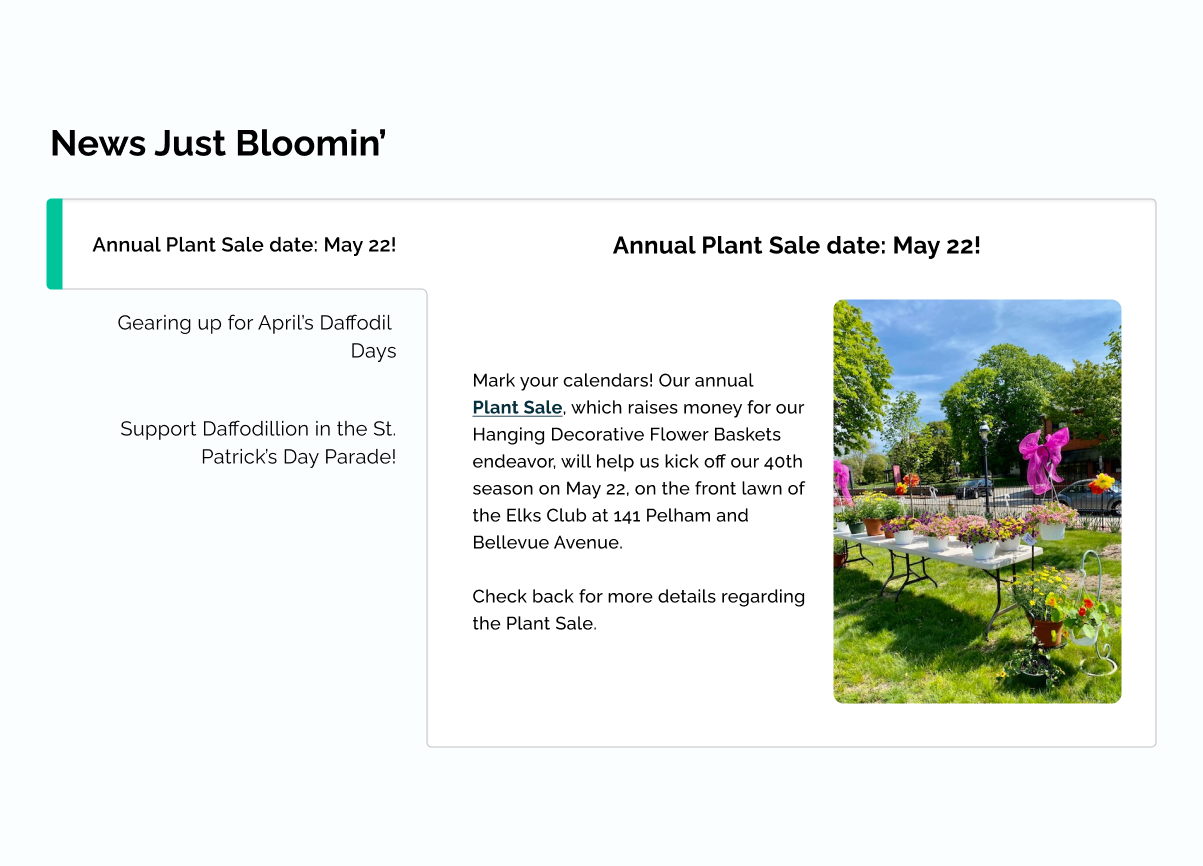
Fix 1: "Happening Now" section
PREVIOUS STATE
An auto-rotating carousel of events and updates.
PROBLEMS
- People don't love automatically moving parts. Moving parts can detract attention and cause overwhelm.
- Only one update was visible at a time. People like to see all their options, so the initial design violated the "recognition rather than recall" heuristic.
- The system was in control. The autoplay takes control from the user.
REVISED STATE
The updates are placed into vertical tabs, with each update summarized in the tab title.
HOW IT ADDRESSES THE PROBLEMS
- No moving parts. The new section is static by default.
- All update headlines are visible. If a user is interested in one, all they have to do is click to learn more.
- The user is in control. They can click whichever update they'd like to see.
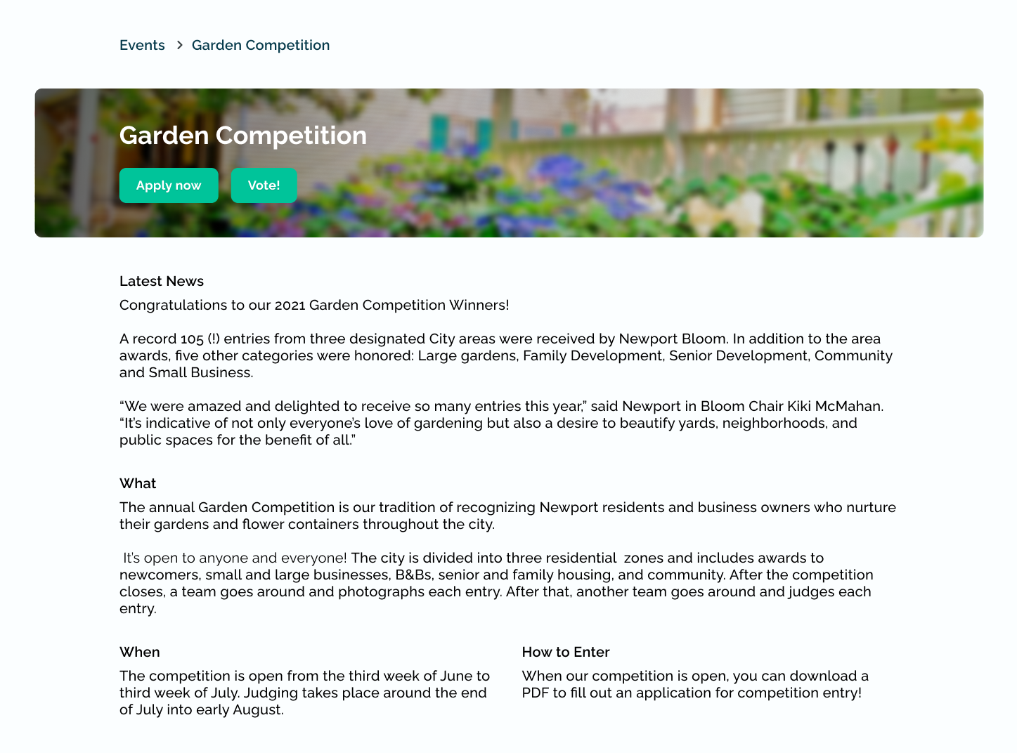
Fix 2: Event page details
PREVIOUS STATE
The header had action buttons in the header picture, and event information was below, separated by headings.
PROBLEMS
- People didn't know what else was on the page. Scrolling down allowed you to see photos and competition results. The header didn't tell them that.
- The visual hierarchy was off. Participants described the headers as difficult to follow; they weren't sure where to look.
REVISED STATE
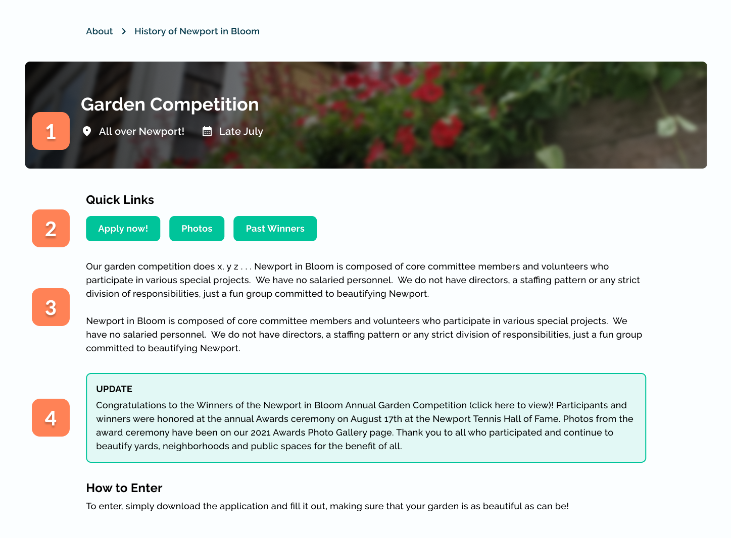
- 1. Location and date information replaced the action items (which, for most events, will not exist). The header serves as a quick summary of the event.
- 2. Quick links for a) action items and b) section links (e.g., clicking "photos" scrolls to the photos section below)
- 3. General description of the event
- 4. "Latest news" ➞ "Updates" and boxed in a separate area
HOW IT ADDRESSES THE PROBLEM
- The section links inform the users what information they can access from this page. This was a problem during usability testing, and some quick re-testing on that particular task proved this to be an effective solution.
- Improved visual hierarchy. There aren't as many homogenous blocks of text— the intention here is to drive the user's attention to the header, then to the update, and then to the rest of the copy.
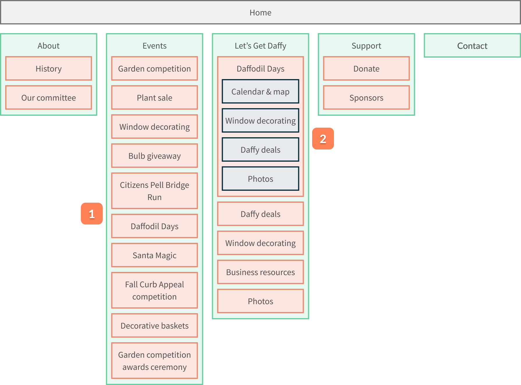
Fix 3: Reconfigured sitemap
PREVIOUS STATE
Six event pages, and Daffy Days as a primary menu item.
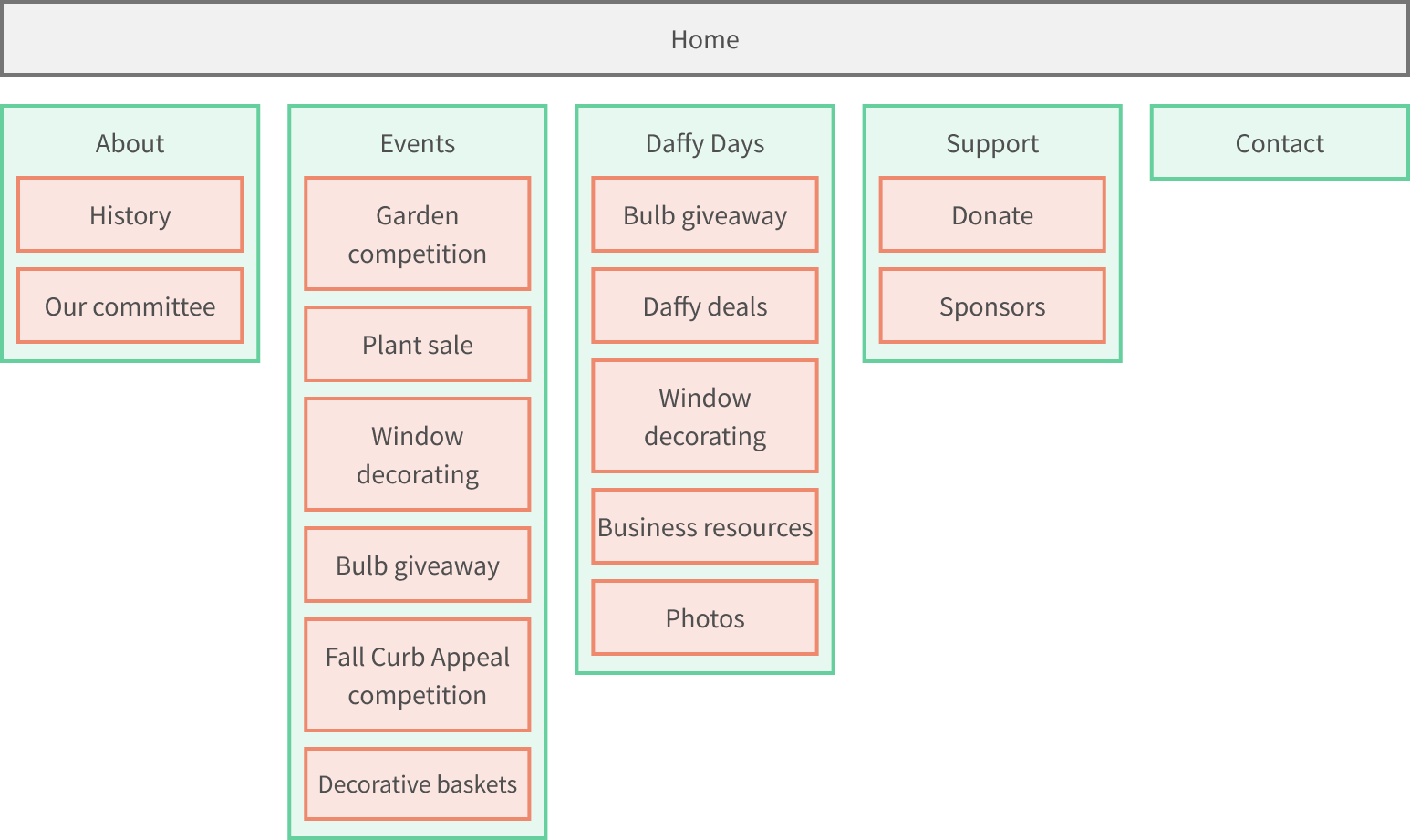
PROBLEMS
- Committee members wanted to include pages for NIB-sponsored events. Now, these were not accessible in the site.
- Daffodil Days needed a restructure. Certain changes were requested by the committee. For example, the Daffodil Bulb Giveaway, while technically a "Daffy" event, took place in October, while the actual festival (called "Daffodil Days") takes places in April, and they decided this distinction was important.
REVISED STATE
- 1. Four additional event pages, including those that are sponsored by Newport in Bloom.
- 2. Daffodil days nested into a "Let's Get Daffy" header, with Daffodil Days specific events as tertiary items.
HOW IT ADDRESSES THE PROBLEM
- Inclusion of NIB-sponsored events. Previously, these were inaccessible, so the fix was simply to add them in.
- Daffodil Days structure more closely resembles the organization's structure. While not necessarily a UX fix, this was required by the committee and allowed them to rest easy at night.
Final UI
After incorporating feedback from usability testing, I finalized the design and developed the site using WordPress and Elementor Pro. The final product is a fully responsive, accessible website that successfully combines Newport in Bloom and Daffodil Days.
REFLECTION
This project taught me the importance of balancing stakeholder desires with user needs. While the Newport in Bloom committee had strong opinions about what they wanted, user research revealed some different priorities. By combining insights from both groups, I was able to create a solution that satisfied everyone.
The mobile-first approach was crucial to the project's success. By starting with the most constrained layout, I ensured that the content hierarchy was clear and that the site would work well on any device. This also made the development process much smoother, as I could progressively enhance the experience for larger screens rather than trying to retrofit responsive behavior later.