Summary
TEAM
Me (researcher, designer)
TIMELINE
February - March 2022
TASK
Design an end-to-end mobile app to make grocery shopping easier and more efficient.
TOOLS & LANGUAGES
Figma, Adobe Illustrator, Lucidchart
Background
A hypothesis about grocery shopping
Grocery shopping can be a bit of a hassle, but have you ever wondered why that is? I set out to find the root of the problem and see if I could make the experience a little more pleasant.
My hypothesis was that the difficulty of finding items in the store was a big part of the problem. So, I set out to validate this hypothesis and create a solution that would make that aspect of grocery shopping a breeze.
Final product and results
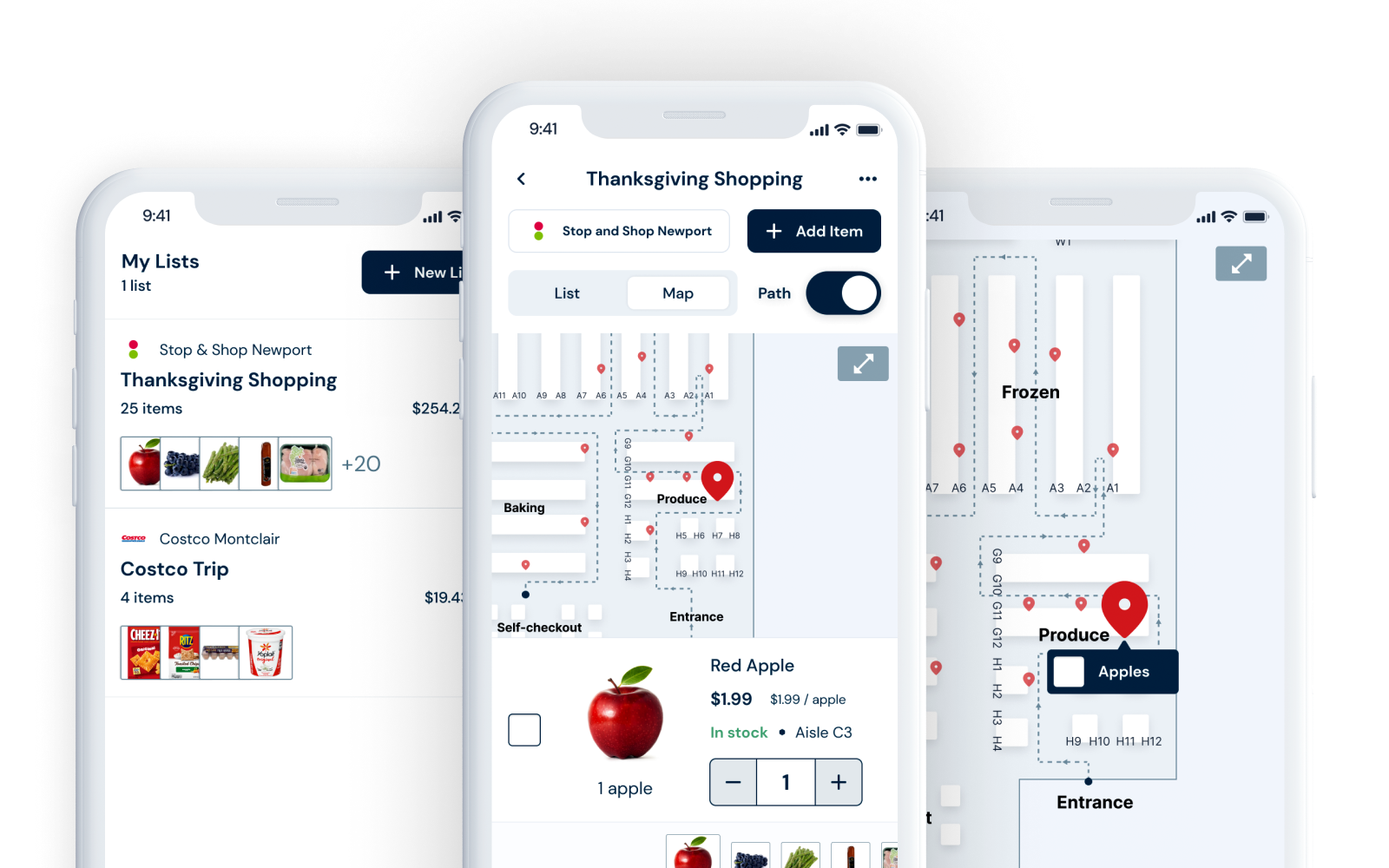
Frictionless food finding
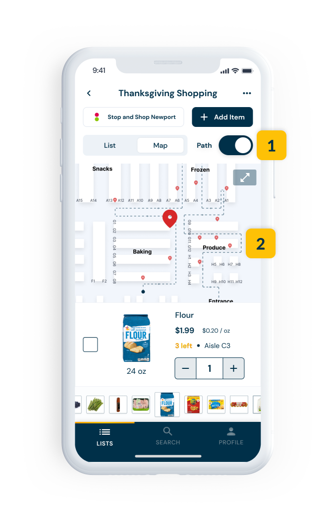
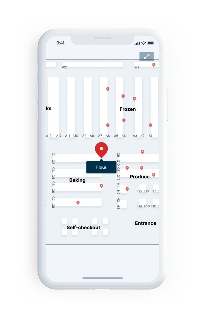
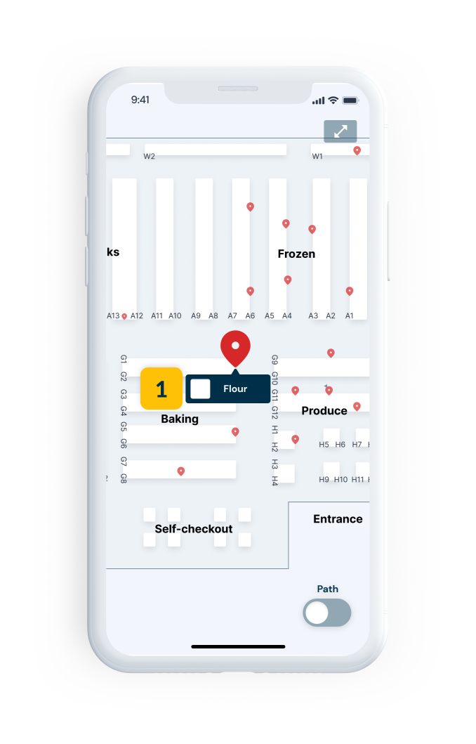
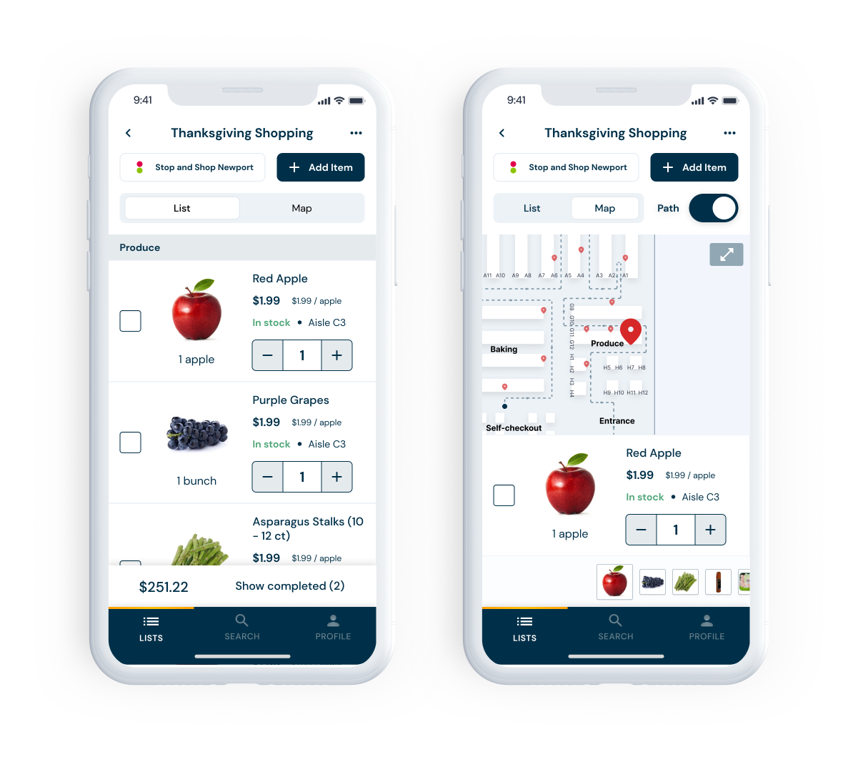
Figma prototype →In this example, I have to do my Thanksgiving shopping at Stop and Shop. I've already made a list, and I'm in the store, but I'm having trouble finding the flour. I use the app to look at the store map to find that item's location.
RESULTS
- Real-time item information. See and mark whether an item is in stock and access a complete nutrition label.
- Store map. Can't find an item? Just look at the map. It'll tell you exactly where it is.
- Your list, mapped out. See where all the items on your list are on an accurate store map.
- The most efficient path. The app will show you the most efficient path to gather all the items on your list, so you can get in and out of the store quickly.
Research
This was a generative research process - I didn't quite know if people hated grocery shopping or, if they did, why people hated it. So, I came up with a set of questions to generate some answers.
- Is finding items in stores difficult? (problem validation)
- How do people find things in stores they've never been in?
- (How) Do other apps/stores solve the problem?
- Do people use shopping lists? If so, how?
- What, in stores, helps shoppers find items?
User interviews
Gleaning insights through interviews
First, I needed to validate the problem. I did this by interviewing potential users: those who go grocery shopping.
It turns out people generally dislike grocery shopping, and their most significant pain point is when they can't find something. They'll usually use brute force to find the item, which is often slow. They want to be guided in the right way and save time.
User perspectives
"When I can't find an item, I walk up and down aisles where it might be. Customer service is far away, so it takes less time to go up and down all the aisles. And I feel really, really frustrated."
Sandy, age 59
"I get wicked frustrated if it takes longer than normal to find something. If I can't find it in 5 minutes, I'll get pissed and ask someone near me or find a worker."
Conner, age 23
"If I can't find something, I give up. I don't think I've ever asked someone for help--it feels embarrassing. I'm very determined to find things by myself and feel stupid if I can't."
Juliana, 22
TAKEAWAYS: USER INTERVIEWS
- People dislike grocery shopping. Common complaints included that items are sometimes hard to find, it feels like a chore, and it takes a lot of time.
- People feel frustrated when items are hard to find. Whether the item isn't where it's expected or out of stock, every participant said the word "frustrated" when asked to think about the last time an item was hard to find. One even said she usually wants to scream.
- Typically, brute force is the algorithm for a hard-to-find item. People will look for an aisle they think matches what they're looking for and then will look at every item on the aisle until they recognize a color, logo, or packaging.
Competitor analysis
Understanding the market landscape
I couldn't find anyone who alleviated the exact pain point I was trying to target. Still, I found some awesome apps (some of which I will undoubtedly use in the future) that gave me insight into what's already out there.
AnyList is a list-making app for groceries that auto-organizes items by category and allows recipe storage with shareable lists.
- Auto-organizes grocery items by nutrition categories
- Allows you to store recipes
- Lists are shareable with and without an account
- No pictures, brands, or store links
- Simple but slightly outdated UI
- More of an organizer than a shopping solution
Target's app shows item locations using a virtual store map with aisle numbers and stock information, but prioritizes online purchasing over in-store shopping.
- Shows store layout and item location on a map
- Notes stock levels and specific aisle numbers
- Organizes items in alphabetical aisle order
- Supports Siri for adding items on iOS
- Prioritizes purchasing online vs. using as shopping list
- List view doesn't show prices or totals
Stop & Shop's app features bold visual design with auto-sorted items by section, clear pricing, and extensive product details.
- Auto-sorts items by store section
- Cart shows prices very clearly
- Bold visual design with strong use of red
- Shows past purchases and nutrition details
- Doesn't note aisle numbers, just general sections
- Heavy focus on coupons and rewards
Kroger's app provides basic list functionality with item pictures, prices, and aisle numbers, alongside heavy coupon advertising.
- Pictures of items along with prices
- Item information includes aisle numbers
- Basic grocery list with total price calculation
- Information architecture matches general store layout
- Heavy focus on coupons, savings, and deals
Basket compares prices across stores and allows dietary preferences, but lacks location information and requires specific product searches.
- Compares prices at multiple stores
- Can create different types of lists
- Allows users to set dietary preferences
- Has no location information within stores
- Cannot search generically—requires specific product names
- Focuses on achieving lowest price
Total Wine's site includes aisle numbers with left/right directions and standard product photos, but lacks robust list-keeping features.
- Clear, standard photos of products
- Item pages include aisle number and side (left/right)
- No dedicated list-keeping mechanism
- Functions more like a shopping cart than a list
- Recommended by interview participants for its location features
TAKEAWAYS: COMPETITOR ANALYSIS
- Inventory and location information is often readily available. This information is necessary for employees to restock shelves, and tons of stores' shopping apps share this information with customers.
- Item information is essentially standardized. There is specific information required to be disclosed about food items, especially on the nutrition label. Most also include aisle number, price, and unit price.
- Most apps focus on either sales or lists. The closest I could get to solving users' primary pain point was with the Target app, but most of the apps I found focused on saving money or just keeping lists.
Define
After conducting research, I defined the key features and functionalities of the app. I created a user flow to ensure the most efficient and streamlined experience for users. I also outlined the specific requirements for the app to meet the needs of the target market.
User flow
Mapping out the shopper's journey
I defined two cases where the user may use the app:
- As a list-keeping app. This includes assigning a store to a list, adding items to that list, and checking off those items as you go along.
- As an item locator. You just want to find a hard-to-locate item-- you don't want to make a list.
USER FLOW
The flow allows users to either shop with a pre-made list or search for a specific item and ends when all items on the list have been located or when the user has found the item they were searching for.

Product requirements
Clarifying the product vision
I came up with six high-level sections to wireframe and test based on feature brainstorming and flows from the persona's tasks.
| Area | High-level requirements |
|---|---|
| Log in / sign up | Allows user to create or access an account |
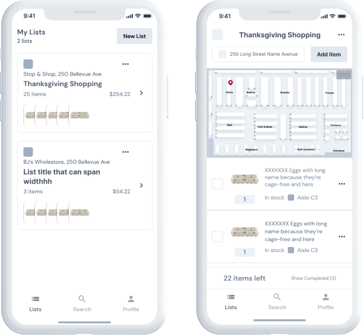
| All lists | Allows user to see all lists they have and create new lists |
| Single list | Allows user to view a single list and its associated information |
| Shopping mode | Allows user to indicate that they're shopping from a specific list and to be guided through the store |
| Search | Allows user to enter keywords to search for items at a specific store |
| Account | Shows information about a user's account, including sharing capacities and list history |
With the product and its requirements defined, I began to design.
Design
Designing a product is a delicate balance of form and function. I began my design process by creating wireframes using Figma to map out the user interface and ensure an efficient user flow. With the foundation of the user interface in place, I then set about creating a unique brand, including the development of a logo, brand colors, and typography. I used these branding elements to style the wireframes and bring the app to life visually, ensuring a cohesive and consistent look and feel throughout the user experience.
Wireframes
Creating the blueprint
View wireframes in Figma →My wireframes served as a blueprint for the final product and as a tool to test and iterate on the user flow and interface design.
Styling
Creating the brand
Because I was making this app, I decided to name it Beeline, as the idea is that you can use it to go directly to the items you need.
LOGO DESIGN
The three hexagons represent a beehive, and the colors are meant to be warm but also clean.
I made a general UI kit following the logo creation based on common elements from my wireframes.
COLORS AND TYPOGRAPHY
I considered using yellow as the primary color to match the "bee" theme, but I realized that it could be challenging to use consistently and may not always look great. Instead, I decided to use a dark blue instead and use yellow as an accent color for a more cohesive and visually pleasing design. I also chose a clean, sans-serif font to look good on mobile devices.
Color Palette
Primary
#003049
Secondary
#C8004E
Outline
#5B7B89
White
#FFFFFF
Primary Decorative
#FEC106 ➞ #FEA104
Typography
Aa DM Sans 700
Lorem ipsum dolor sit amet, consectetur adipiscing elit. Suspendisse varius enim in eros elementum tristique. Duis cursus, mi quis viverra ornare, eros dolor interdum nulla, ut commodo diam libero vitae erat. Aenean faucibus nibh et justo cursus id rutrum lorem imperdiet. Nunc ut sem vitae risus tristique posuere.
Aa DM Sans 400
Lorem ipsum dolor sit amet, consectetur adipiscing elit. Suspendisse varius enim in eros elementum tristique. Duis cursus, mi quis viverra ornare, eros dolor interdum nulla, ut commodo diam libero vitae erat. Aenean faucibus nibh et justo cursus id rutrum lorem imperdiet. Nunc ut sem vitae risus tristique posuere.
I applied the UI kit to the wireframes to come up with a first-round version of how the app may look.
Below is a mockup of a single list and its associated map view. Annotated are a few design decisions I made in the process.
DESIGN DECISIONS
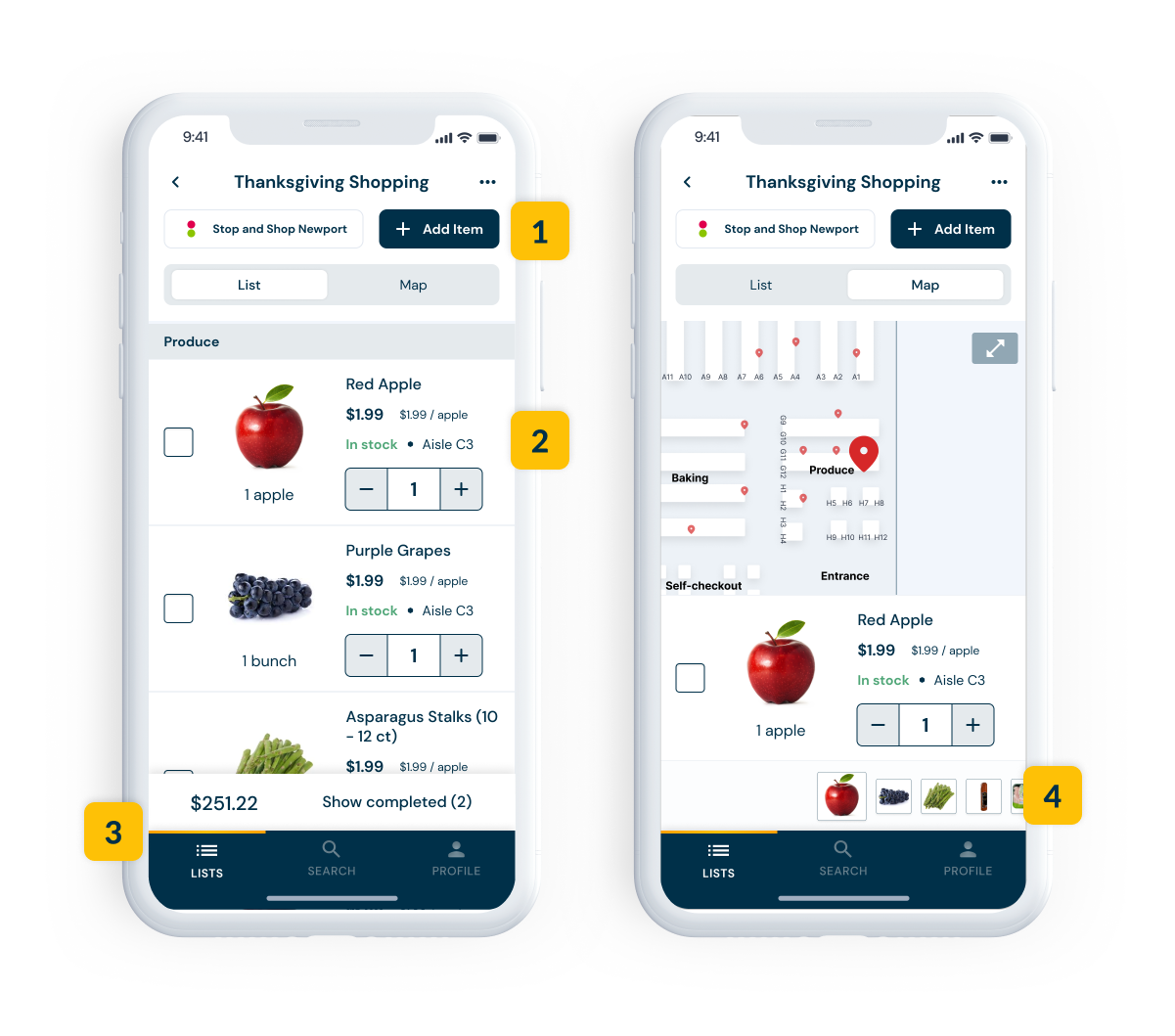
- The primary blue was used for buttons and the bottom navigation. Because it was a dark color, it generally stood out from the rest of the design.
- I chose to use a variation of a ghost button for the secondary button style to keep some contrast but to not overtake the primary actions.
- I found it difficult to incorporate the accent color into the design; one place I did was to represent the active tab.
- One change I made from the wireframes was to include a swipe-to-view (similar to Photos in iOS) of the grocery items on their list.
Test
Bringing a product to market is a iterative process that requires constant testing and refining. I conducted usability testing to gather feedback on the app's user interface, navigation flow, and overall user experience. Based on the feedback, I identified and prioritized the key usability issues that needed to be addressed. Using the results of the testing, I was able to iterate on the design and make improvements to the user experience, ensuring that Beeline was as user-friendly and efficient as possible.
Usability testing
Putting it to the test
I conducted usability tests with six participants over two days. To do this, I came up with seven core tasks and had participants click through the Figma prototype.
| Task | Direct success | Indirect success | Gave up | Notes |
|---|---|---|---|---|
| Add list | 100% | 0% | 0% | All participants immediately did the expected behavior (tap the "New List" button) and understood that each list must be associated with a store |
| Add item to list | 100% | 0% | 0% | Feedback was that search was quick and familiar |
| Locate item in store (from list) | 33% | 50% | 16% | Participants went to map view and had trouble performing the right interaction (swipe); the participant who gave up reported not thinking they could drag on the computer |
| Locate item in store (from search) | 100% | 0% | 0% | Involved searching and tapping map view; no dragging |
| Look over list | 100% | 0% | 0% | Involved tapping a list |
| Change store (from search) | 100% | 0% | 0% | Participants reported that this made sense (no issues) |
| Check off item | 100% | 0% | 0% | Intuitive; same flow as other list applications (tapping a checkbox) |
Generally, the app was easy to navigate, and there was 100% direct success on every task besides one: find the flour at Stop & Shop. The expected behavior involved swiping to the left on the preview list at the bottom of the screen. I hypothesized two reasons why this could have happened:
- The prototype was on a computer. This was primarily because the testing took place over Zoom, and swiping isn't natural on computers.
- The prototype was finicky. Some users tried to drag and got "halfway" through the swipe before releasing, resetting the preview bar to its original position. Sometimes, I dragged, and the list didn't move at all.
I tested these hypotheses by recruiting a few in-person volunteers to perform that specific task on a mobile device. They passed with flying colors, so I determined that it was not a priority fix.
TAKEAWAYS: USABILITY TESTING
- Generally, the app was easy to navigate, and there was 100% direct success on every task besides one: find the flour at Stop & Shop.
- Map view required some further exploration. A few issues and questions on that page led me to review that screen for clarity and consistent functionality.
Priority fixes
Areas of opportunity
The core tasks of the usability testing didn't uncover any major problems, but after watching the Zoom recordings and going over my notes, I saw two areas of opportunity. So, I focused on those to improve the overall experience for users.
Fix 1: Show auto-sort more visibly
PREVIOUS STATE
Users believed that the items were listed in the order in which they were added to the list, like a queue.
PROBLEMS
Users were not aware that the list was already sorted in an efficient shopping order. They saw a collection of location icons but didn't understand that the order had been optimized for them.
REVISED STATE
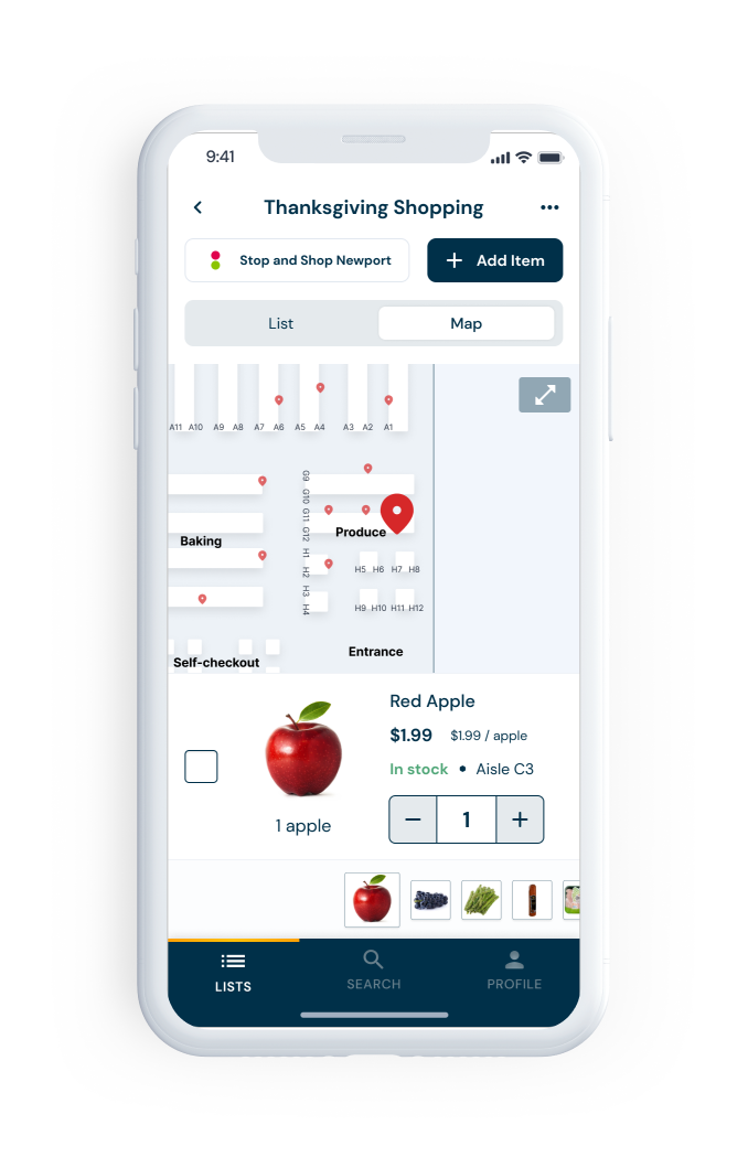
I included a "path" toggle in the map view, which would highlight the path to take to find the items in their list, from the store entrance.
- Added "path" toggle that turns on or off the highlighted path
- Highlighted path with directional arrows
HOW IT ADDRESSES THE PROBLEM
The path guides users through the store as they would see on a map, using arrows to show them the most efficient route and making it clear which item they should pick up next.
Fix 2: Item checkoff in each view
PREVIOUS STATE
Users can only view - not check off - items once they expand the map.
PROBLEM
General inconsistency caused confusion. Users expected to be able to check off items in this view.
REVISED STATE
- Added checkbox in expanded map view to facilitate item check-off
HOW IT ADDRESSES THE PROBLEM
Increases consistency. This better aligned with user expectations and didn't unnecessarily restrict functionality.
Final UI
Figma prototype →Here's a preview of the final UI after integrating the priority fixes. Because this is a concept, there are no next steps. But I do believe that this is a significant pain point and would love to have this solved. It would be interesting to see it become part of some existing grocery store shopping initiatives, such as Amazon Go. Although, I think if I showed a developer this, they may cry once they see the map view, and I'd love to ideate alternatives to my first priority fix. I share some more concrete takeaways below.
TAKEAWAYS: FINAL UI
- I like constraints. This was a fun project, but I felt a bit lost when it came to thinking about what was feasible and what wasn't. There is some intrinsic allure to being able to do anything you want, but if it's not realistic, it's not as fun. I want to create tangible things with real impact.
- In-depth documentation makes everything so much easier. I've always enjoyed being thorough, but being clear about my requirements made the design process more manageable because I was never scared of missing anything. I felt on top of the project at all times.