Summary
TEAM
Me (Founder and Principal Designer)
Zoya Lehrer (Founder and CEO)
Christiana Davies (Design Advisor)
TIMELINE
June 2023 - Present
TASK
Create a brand for a B2C mobile app.
TOOLS & LANGUAGES
Figma, Illustrator, After Effects, React Native
Orgo is a mobile app that streamlines personal logistics—ensuring the right people get to the right places on time. While our initial focus is on busy families, the app's utility extends to various scheduling scenarios. As a co-founder, I contributed across multiple areas: brand creation, marketing site design, and app design and development.
This case study outlines the journey of creating Orgo's brand identity and web presence from scratch. I created the original logo files, and, using Webflow, I personally designed and built each iteration of our site. The process unfolded in several key stages:
- Brand Creation: Developing our logo and visual identity
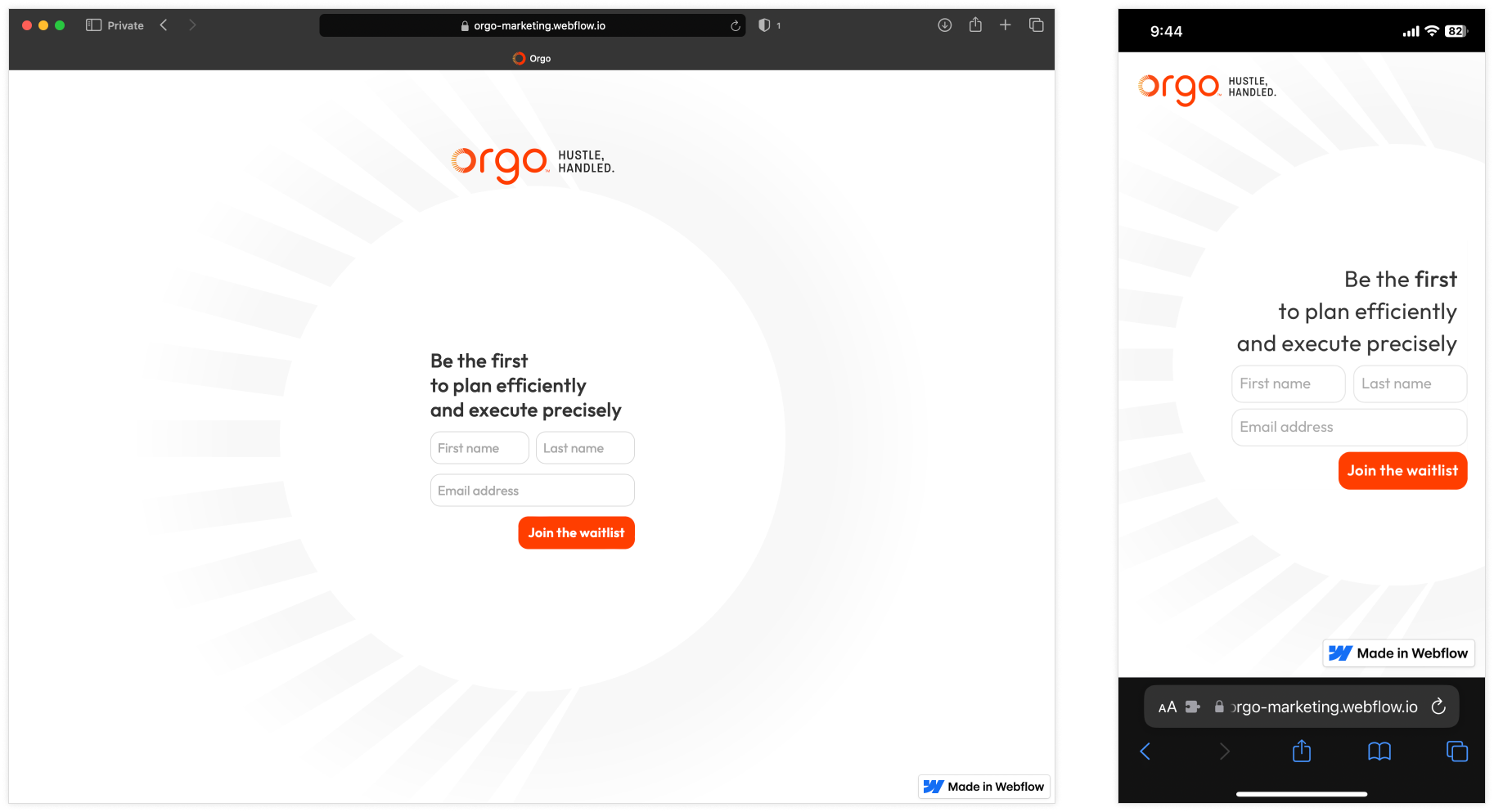
- Initial teaser site: A minimalist web presence during stealth mode
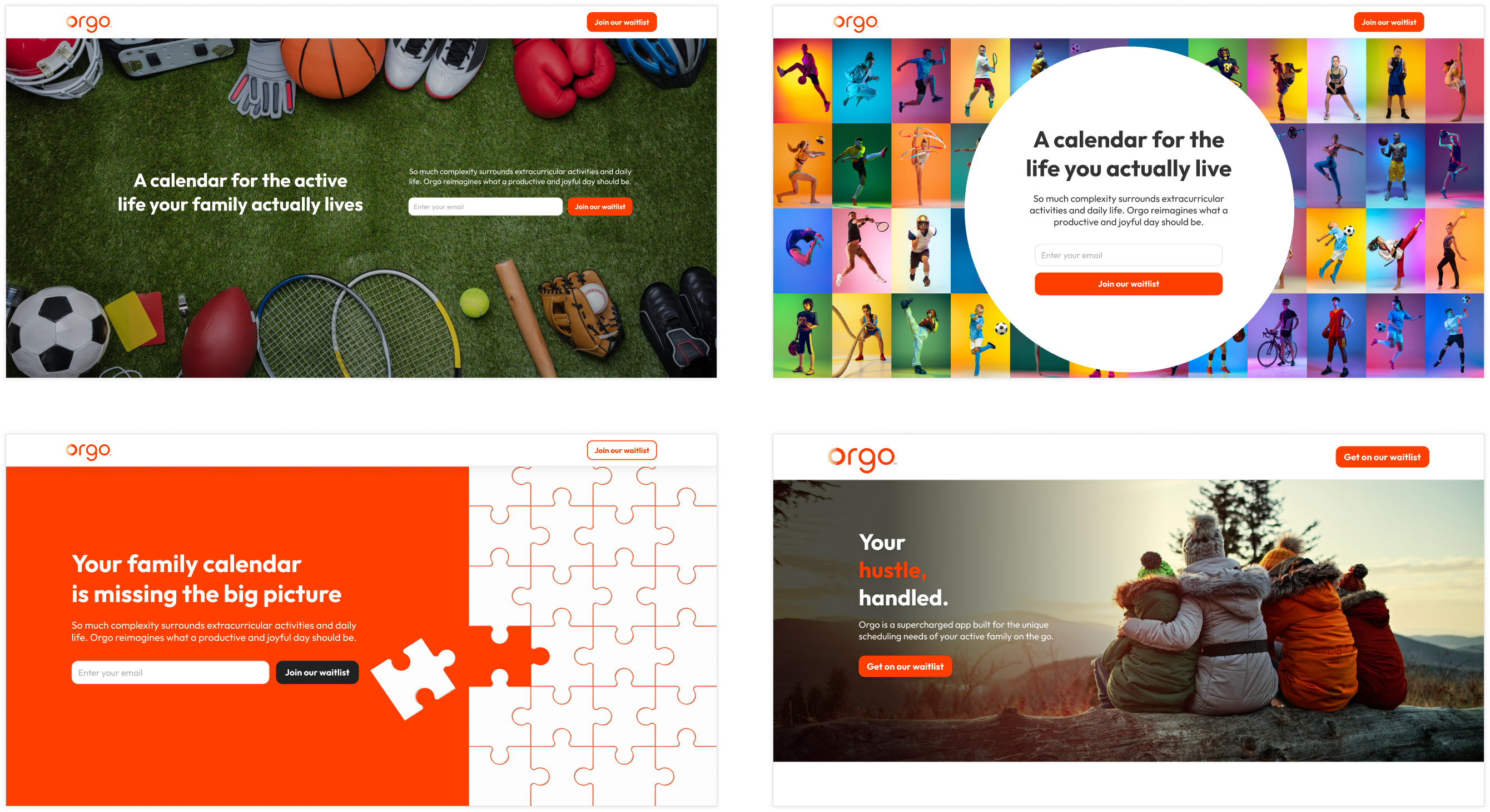
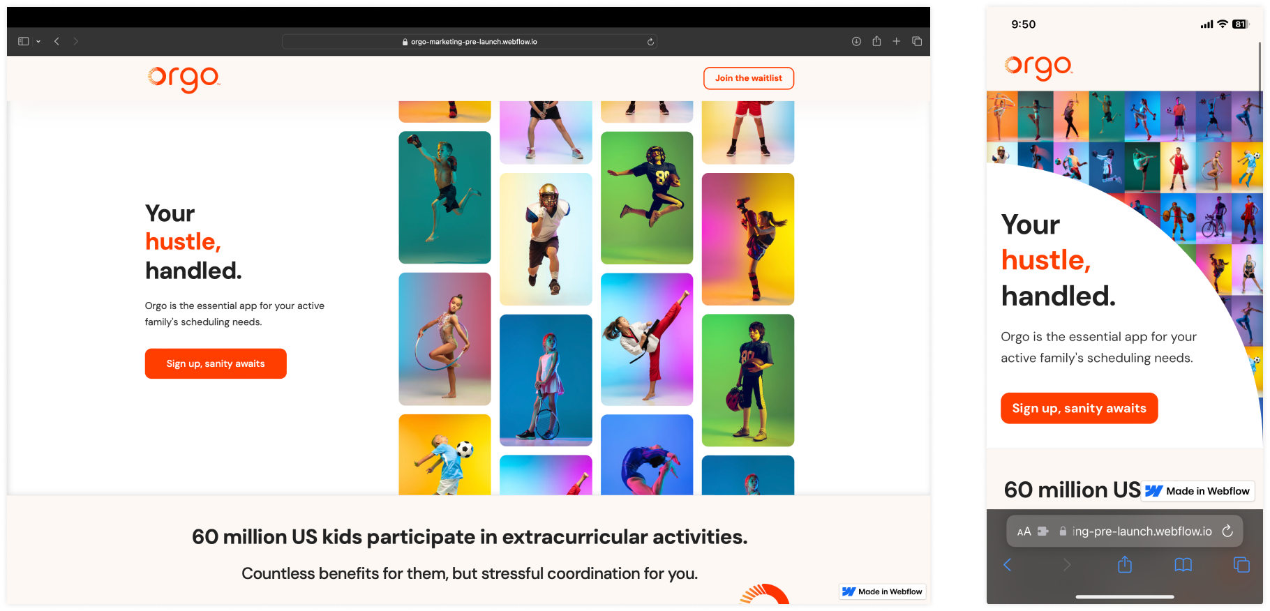
- Expanded teaser site: An enhanced site with more information, still pre-launch
- Launch Site: Our current website, featuring app visuals and a download CTA
Throughout this process, I adapted our online presence to match Orgo's development stages, from building anticipation to driving app adoption. My hands-on approach ensured consistency across our brand and web presence at every step.
View the current marketing site →Brand creation
Our journey began with finding the perfect name. After exploring various options, we landed on 'Orgo'. This name resonated as a clever derivative of 'organization on the go', and our target audience found it appealing and memorable. Importantly, both the domain and App Store names were available. We deliberately avoided terms like 'fam' or 'kids' to ensure our brand could expand beyond our initial family-oriented use case. Feedback from potential users described the name as 'super cute', which we saw as a positive sign for its broader appeal. With our name in place, we moved on to the crucial task of logo design.
Logo development
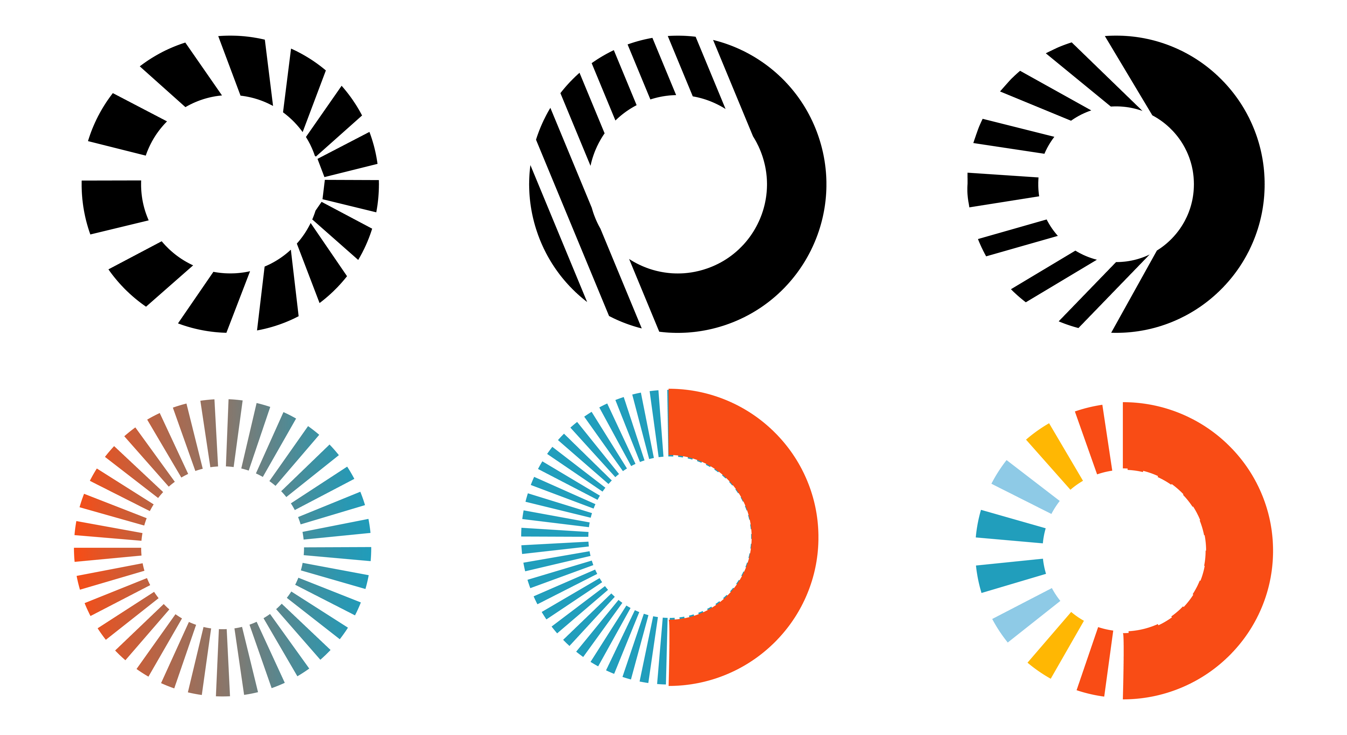
We centered our logomark on a circular shape, echoing the leading 'O' in Orgo. Our goal was to incorporate elements of time, driving, or movement within this form, reflecting our app's core functions. Through multiple iterations, we explored various designs, trying to balance simplicity with meaningful representation of Orgo's purpose.
Parallel to logomark development, we crafted a complementary wordmark and color scheme. We tested various typographic styles, prioritizing readability based on user feedback. Simultaneously, we explored vibrant color combinations using orange, yellow, and blue to create an appealing palette that aligned with our brand vision.
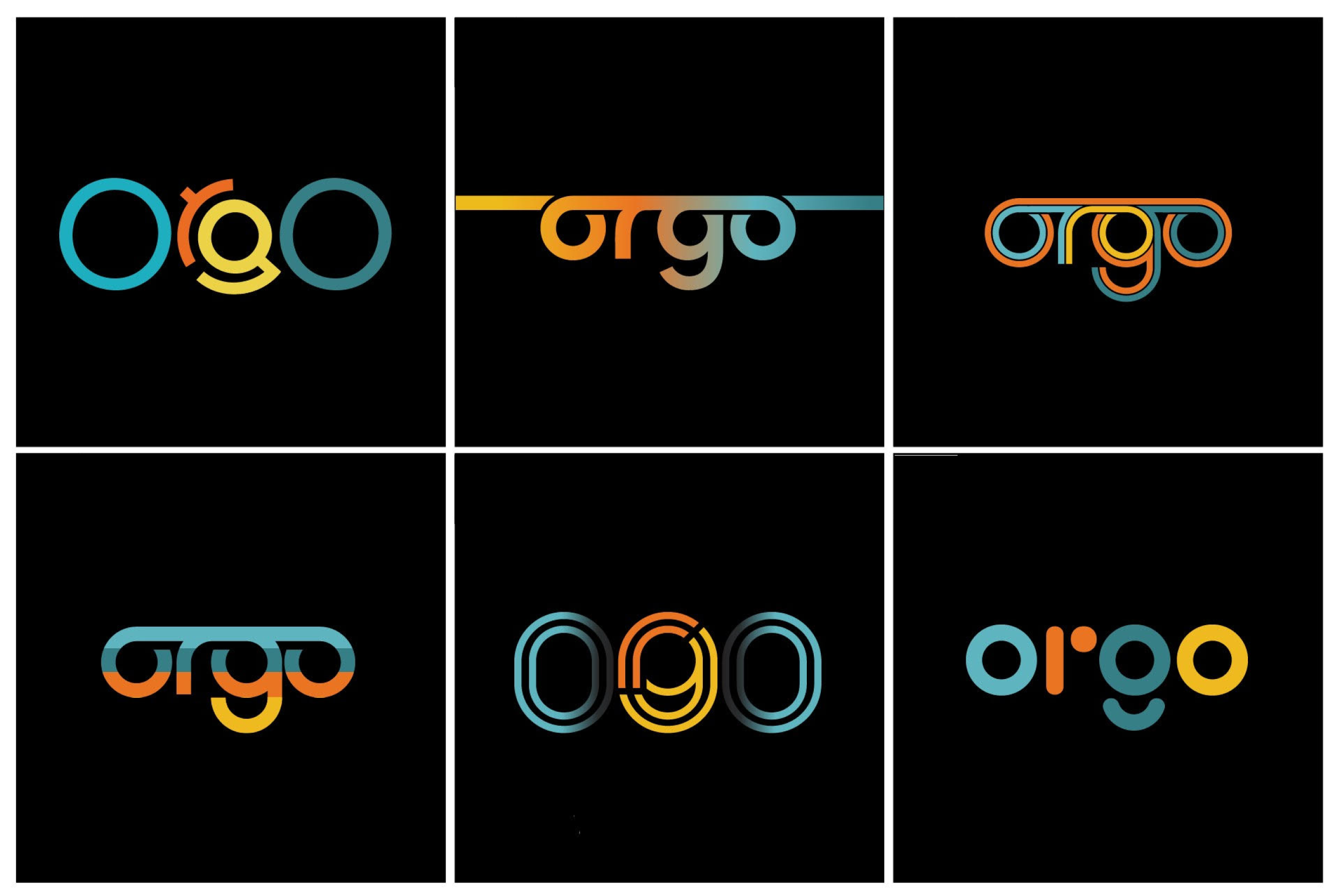
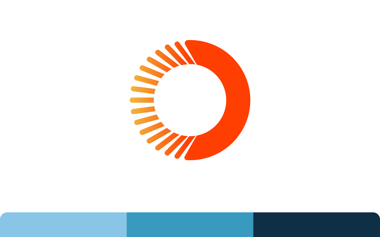
Our breakthrough concept centered on the transition from chaos to order. We designed the 'O' in Orgo with a fragmented left side evolving into a whole right side, symbolizing this transformation. This design represented our app's purpose: bringing order to chaotic schedules.
For the remaining letters 'rgo', we kept the design clean and whole, ensuring readability. This approach addressed user preferences for clarity while complementing the dynamic 'O' concept.
THE FINAL LOGO
The final Orgo logo embodies our core concept through its thoughtful design:
- The 'O' transitions from fragmented to whole, representing the shift from chaotic schedules to organized routines
- The circular shapes evokes ideas of time, cycles, and continuous improvement
- Clean, readable typography in 'rgo' balances the dynamic 'O', ensuring clarity and brand recognition
Launch site
As we prepared to launch our app, we recognized the need for a website that would effectively showcase Orgo and drive downloads. We set three primary goals for this iteration:
| Goal | Action plan |
|---|---|
| Drive downloads | Implement direct download links, with QR codes for desktop users to easily access the mobile app |
| Explain the problem | Refine our problem statement based on feedback, maintaining the core message from our previous site while adding more specific details |
| Provide app overview | Lead with app functionality, showcasing specific screens and explaining key features |
This approach aimed to create a seamless transition from website visitor to app user, while providing a clear understanding of Orgo's value proposition and functionality.
View the current site →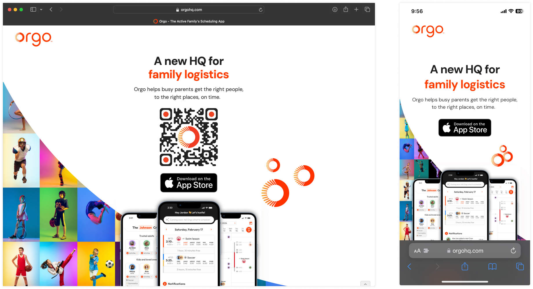
Next steps
Our launch site is effectively driving downloads and showcasing Orgo. However, we're aware that for mobile apps, websites aren't typically the primary conversion driver. With this in mind, we're content with the site's current performance and are now focusing on other channels for user acquisition.
We periodically review the site to ensure it aligns with our evolving product and brand. This includes updating app screenshots and feature descriptions to accurately reflect Orgo's current functionality. While no longer our primary focus, the website remains a valuable component of our overall marketing strategy, serving as a reliable information source for potential users and partners.